(Android) Twilight Zone.

N

Nik Barbour

Guest
Having trouble distinguishing which panels are lit, and which are non-lit, outer perimeter door panels (flashing ones I can see, and large central red panels).
Could the on/off contrast be improved please?
 
N

netizen

Guest
I have noticed that as well. I'm attaching a screen grab to help illustrate it.

tz.door.light..png
 

Kolchak357

Senior Pigeon
May 31, 2012
8,102
2
Are these the standard colors for the pop bumpers? The TZ I play locally is different (the one I play may not be correct). Is it just random?
 
N

Nik Barbour

Guest
Are these the standard colors for the pop bumpers? The TZ I play locally is different (the one I play may not be correct). Is it just random?

I questioned this on another thread, but they are correct.

If you go to bottom of ipdb entry for TZ, there is a pdf you can read, which is this letter from a guy who tracked down an unmodified home play only machine, and asked it's owner what order the bumper colours should be.
 

night

New member
May 18, 2012
2,109
0
The table art in the back looks blurry..
As I wrote before, Fairsight needs better transparant plastic texture simulation: look at the clock, it's milky-whitisch, the clock should stand-out!
The glass of the gumball machine could use a little reflection light. The red material of the gumball machine could use an extra reflection as well, it's too flat. It is a cool element of the table but looks unimpressive now.
The table could use a bit more shadow and lighting reflections, this will raise the three dimensional depth of the table. Three dimensional experiance is all about light and shadows, when there is little everything will become 'flat'. (This goes for more TPA tables.)
 
Last edited:

Fuseball

New member
May 26, 2012
484
0
I would argue that the clock front could be completely transparent (no texture at all) for a better look.
 
Last edited:

night

New member
May 18, 2012
2,109
0
As posted in the Android forum, but it might belong here as well:

I would like to give some comments on the playfield artwork. I attached the image, made it a bit lighter so the numbers are better visible:

pinball.jpg


1. The clock looks BAD. It's too ugly even for a beta version. Whoever approved of this should take a day off. The transparant plastic is not working, it turns into milky-white. One suggestion: remove the transparent plastic in front of the clock, leave the sides of the clock with the plastic texture. This simulates transparency and still gives the illusion the whole clock is made of plastic. I have a screenshot of a TZ table where the clock is blue(!), this works-and-looks a lot better (see image below).

2. The glass of the gumball machine is almost invisible, it needs a reflection!

3. The material here looks like chrome, in the example it is clearly made of another material (plastic?) and is darker in color. (see image below)

4. Farsight, please do something about your plastic texturing, these ramps almost looks like chrome, it's grey, it's dull and looks in no way like clear transparent plastic. Take the glass texture of the gumball machine and fine tune it a little.. put that on the ramps, it just can't look any worse than this.

5. I just marked these parts as an example, but there are tons of little screws and bolts that are missing on the TPA table if you compare it to a real one...

6. And again, are these lights made from grey opaque stuff? It should be clear plastic!

-What's wrong with the ball, why does it look dark and not like chrome?

Overall, the Chromework is so-so, transparency simulation is just plain bad. Shadows are forgotten(?)..

One general comment about the graphics of TPA tables; besides all the 3D elements, they are 80% texture mapping (which can't go wrong if your original scans are good) and the other 20% is up to Farsight. And then I am talking about chrome, plastic, lights, etc. And this extra 20% of input is weak. The tables look harsh and very 3D in appearance. It looks like the 3D-work we saw back in the 1990s. A good simulation of reality boils down on good texturing, shadows(!) and lighting. There are hardly any shadows which makes the elements not 'one part' with the table. FLAT looking. Like they are floating around! More shadows from all the elements on the table itself, don't be so afraid of using shadows! Look at the image below, for example you see a shadow of the chrome railing over the table, where is it on the TPA table?! There is no depth. It looks like there is a very ugly bright spot on it, lacks in atmosphere..

I just played Theatre of Magic. This table looks very good, has convincing shadows and hey, the transparent plastic is convincing! Creature of the Black Lagoon, horrible plastic ramps.

Now that wasn't nice, was it? No hard feelings.


Close-up of a real TZ table:

tz_09.jpg
 

xAzatothx

New member
Sep 22, 2012
824
0
Having trouble distinguishing which panels are lit, and which are non-lit, outer perimeter door panels (flashing ones I can see, and large central red panels).
Could the on/off contrast be improved please?
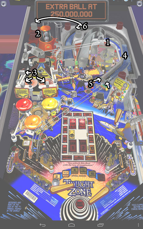

+1 on this. I'm playing on a Nexus 7 and struggle to see whether some of the panels are lit or not.
 

robotronjohn77

New member
Sep 13, 2012
17
0
There are 6 clear star posts missing on the power field. Plus those metal parts indicated above. The clock is not lighting up during modes. Plus the reversed slings. Other than a few other minor issues I am VERY impressed. Heck they even included the lines showing the mylar near the rocket kicker/slot machine....
 

Members online

No members online now.

Members online

No members online now.
Top