Roo
New member
- Jul 5, 2013
- 158
- 0
Please Use Higher Quality Playfield Art (Attack From Mars)
Not really a bug, but I'll list my specs anyway...
OS Version: Windows 7
Graphics Card: NVIDIA Geforce GTX460
Ram: 4GB
Version #(Bottom right of game screen): 0.010
Display Mode: “Full Screen”
Display Resolution: “1680x1050”
Comment:
The quality of the playfield image on Attack From Mars seems quite poor to me, like it is either really low-resolution or highly compressed. Maybe it's using an art asset intended for a less-capable platform?
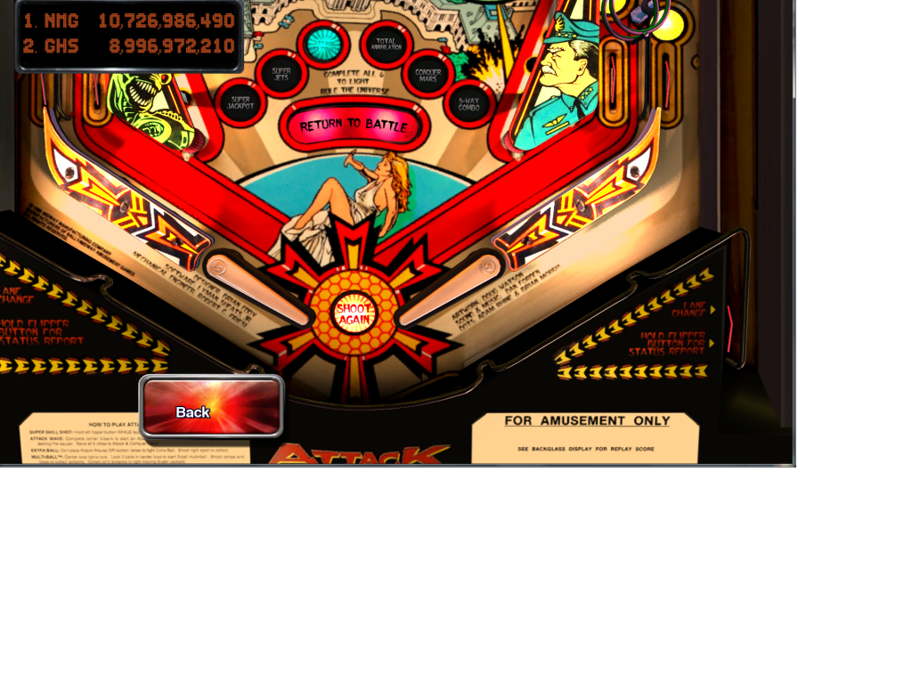
Here is a screenshot taken in exploration mode with post-processing turned off. Notice how the small words (like the credits) are kind of fuzzy and none of the black lines are solid; it kind of looks like they were drawn in crayon.
However, notice that the alien and soldier art on the slingshots looks great! Nice crisp black lines.
Click here for full size version where you can really see it. (you may have to click to magnify if your browser shrinks it to fit)

Here is a pic from ipdb for comparison:

I don't expect perfection, but hopefully there is higher-quality art that can be used. I just want the tables to look their best, especially for the eventual cabinet/portrait support!
Not really a bug, but I'll list my specs anyway...
OS Version: Windows 7
Graphics Card: NVIDIA Geforce GTX460
Ram: 4GB
Version #(Bottom right of game screen): 0.010
Display Mode: “Full Screen”
Display Resolution: “1680x1050”
Comment:
The quality of the playfield image on Attack From Mars seems quite poor to me, like it is either really low-resolution or highly compressed. Maybe it's using an art asset intended for a less-capable platform?
Here is a screenshot taken in exploration mode with post-processing turned off. Notice how the small words (like the credits) are kind of fuzzy and none of the black lines are solid; it kind of looks like they were drawn in crayon.
However, notice that the alien and soldier art on the slingshots looks great! Nice crisp black lines.
Click here for full size version where you can really see it. (you may have to click to magnify if your browser shrinks it to fit)

Here is a pic from ipdb for comparison:

I don't expect perfection, but hopefully there is higher-quality art that can be used. I just want the tables to look their best, especially for the eventual cabinet/portrait support!
Last edited:
