-
Welcome Back to Digital Pinball Fans - please read this first
You are using an out of date browser. It may not display this or other websites correctly.
You should upgrade or use an alternative browser.
You should upgrade or use an alternative browser.
Kevlar
New member
- Feb 20, 2012
- 2,631
- 0
I also have spotted a few minor graphical glitches with Gorgar so they'll fit nicely into this thread;
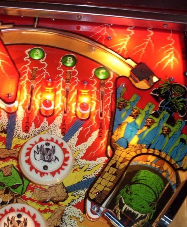
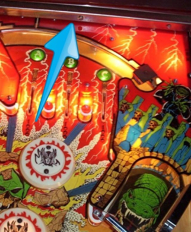
First an image showing what HOW is explaining above, there is a rail there but it looks like a steel band that runs behind it is missing so exposing the back of the table;

The plunger tunnel is not large enough for the ball so the ball glitches through the top of it;

The GOR and GAR drop targets are sat in a groove which when exposed by dropping the targets shows the carpet below the table. Its more obvious when the table is scrolling;

There is a thin horizontal line across the center of the table;

Like I said, all minor things which hopefully FS will address.
I must say that overall I am very happy with how the table looks, the pop bumpers ( jet bumpers? whats the difference? ) in particular look great, they make the monster bash equivalent look like crap. Its probably because of the overall lack of toys/ramps etc on the table enabling this higher detail but the whole thing looks a lot better than Monster Bash. I also like how much the table scrolls letting you get a good look at the detail at the top of the table, Monster Bash hardly scrolls at all.
First an image showing what HOW is explaining above, there is a rail there but it looks like a steel band that runs behind it is missing so exposing the back of the table;

The plunger tunnel is not large enough for the ball so the ball glitches through the top of it;

The GOR and GAR drop targets are sat in a groove which when exposed by dropping the targets shows the carpet below the table. Its more obvious when the table is scrolling;

There is a thin horizontal line across the center of the table;

Like I said, all minor things which hopefully FS will address.
I must say that overall I am very happy with how the table looks, the pop bumpers ( jet bumpers? whats the difference? ) in particular look great, they make the monster bash equivalent look like crap. Its probably because of the overall lack of toys/ramps etc on the table enabling this higher detail but the whole thing looks a lot better than Monster Bash. I also like how much the table scrolls letting you get a good look at the detail at the top of the table, Monster Bash hardly scrolls at all.
Last edited:
DopedToInfinity
New member
- Mar 31, 2012
- 440
- 0
Missing rail and metal bar
I'm missing the rail and metal bar at the back on IOS 5.1.1 IPad 2 as well.
I'm missing the rail and metal bar at the back on IOS 5.1.1 IPad 2 as well.
HOW
New member
- Feb 21, 2012
- 537
- 0
- Thread starter
- #4
I'm missing the rail and metal bar at the back on IOS 5.1.1 IPad 2 as well.
Someone on another thread said they had it-But I'm unsure if they got what I meant.
Here's some pics:
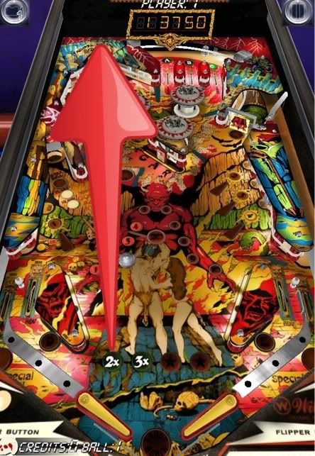
TPA's pic from iApp Store
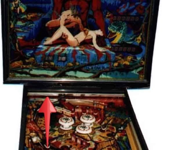
Pic 1 from IPDB
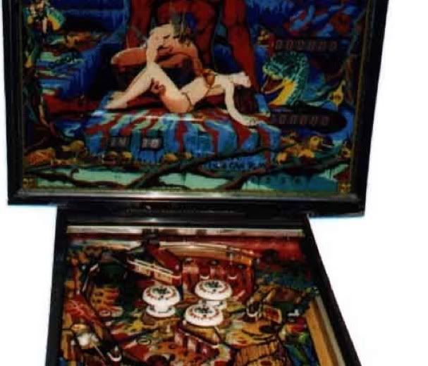
Pic 2 from IPDB
Both clearly showing Top Rail-And lack of 'black space' between coloured PF and PF glass.
I have some issues on the artwork quality with MB too.
The Siderail look WAY to THICK in comparison with other tables-and the perspective of both Gorgar and MB seems off-They taper away/narrow too much IMO.
Shame as other tables and PF of these are lovely!
Spoilt me for my old VP8 FOREVER
Andy
Last edited:
Kevlar
New member
- Feb 20, 2012
- 2,631
- 0
Seems I missunderstood what you meant when you said missing rail, the bit I thought you meant and pointed out in my pic above doesnt look right though, seeing straight into the back of the cabinet.
Anyway, seems they have made a few changes in 1.1.4, firstly they have attempted to deal with the thin line across the center of the table but it actually looks worse now, the line is gone but it looks like they've have pasted some blurry low rez texture over it;

The've also filled in the gaps behind the GOR & GAR drop targets so now you can't see the carpet through the table.
Anyway, seems they have made a few changes in 1.1.4, firstly they have attempted to deal with the thin line across the center of the table but it actually looks worse now, the line is gone but it looks like they've have pasted some blurry low rez texture over it;

The've also filled in the gaps behind the GOR & GAR drop targets so now you can't see the carpet through the table.
starck
New member
- Jun 7, 2012
- 194
- 0
Someone should get on those low res textures in general on this whole table.
And christ, hate to say it, but that's a terrible quickie photoshop job that was done there. (seriously? That's the fix? Paste a lower res image over the hole without any sort of blending it in to the surrounding images?)
you guys must be forgetting how revealing the ipad's screen resolution has become.
