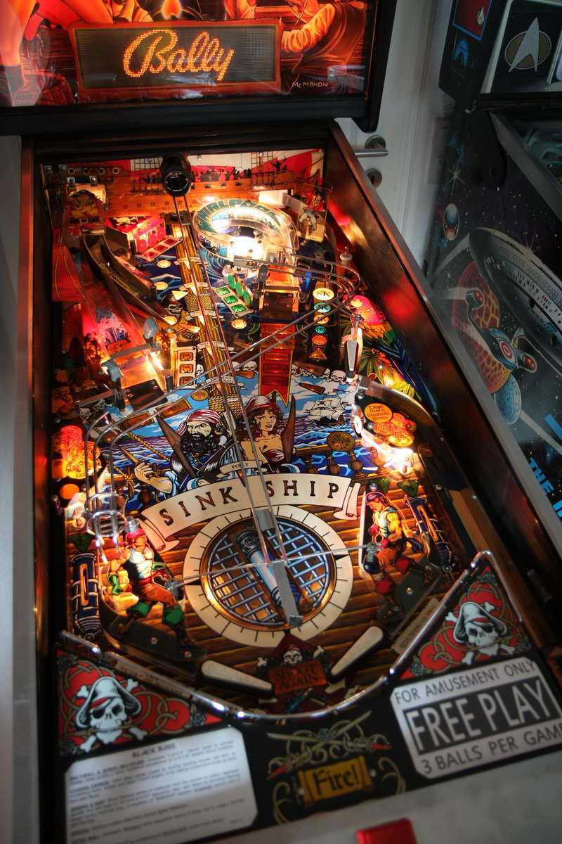
Black Rose Screenshots

night

New member
May 18, 2012
2,109
0
I am afraid we are not going to agree on this topic Jeff.
True, I look at it different perhaps, I know that. I just want the best for this product and I have a very high standard for my self, and I tend to have this for other graphics artwork as well. I'll guess that's what makes me 'me'. :eek:
 
Last edited:

Jeff Strong

Moderator
Staff member
Feb 19, 2012
8,144
2
I am afraid we are not going to agree on this topic Jeff. :eek:

I agree there's room for improvement. Certainly.

I just don't think the playfield colors should look much brighter in a room that dim. Probably too much orange though.
 

night

New member
May 18, 2012
2,109
0
I agree there's room for improvement. Certainly.

I just don't think the playfield colors should look much brighter in a room that dim. Probably too much orange though.

No, not brighter! That's not what I said. Too much orange is my point.
 

Slam23

Active member
Jul 21, 2012
1,279
2
Nice addition to the line-up! I played this one in the '90s alongside greats like Indy '93, Star Wars, and Twilight Zone. Then the table never clicked for me, but I also didn't "get" the Twilight Zone at first (it was not a familiar theme in Holland at that time, not for me anyways), so I'm eager to give it another try. I like the fact that on the PC version anyways, the table doesn't look cluttered, and the rail for the cannon is really nicely done.
Slam23
 

lettuce

New member
Mar 17, 2012
1,086
0
End of the day its horses for courses, FS is never going to keep everyone happy.

Me myself, the darker the lighting the better you get a real sense of a glow and more of an ambient feel from the table, if i had my way i would have the lightning design so it was only the actual table lighting the environment....i know this probably wasn't possible on last gen systems and mobile devices, but this new lightning engine of the PC, PS4 and......maybe Xbox One should be able to achieve this. I guess well find out when the light slider gets its release. I guess i only feel this way because all my memories of play pinball tables were in dimly lit pubs and arcades
 
Last edited:

wolfson

New member
May 24, 2013
3,887
0
hey fellas who cares what colours ,I don`t give a flying toss, I just can`t wait to play BLACK ROSE looks beautiful !!!! :p
 

kimkom

Member
Jan 28, 2013
914
1
No, not brighter! That's not what I said. Too much orange is my point.

I get what you're saying. Looks a little flat and muddy, but not too bad.

Before:
1606400_680295951991468_1547216657_o.jpg


After quick and dirty PShop colour balancing:
Black_rose.jpg
 
Last edited:

Tabe

Member
Apr 12, 2012
833
0
Definitely like the look of the "after" shot there. The rails and so on at least look like metal. There's not a film of orange/brown over everything.
 

night

New member
May 18, 2012
2,109
0
Definitely like the look of the "after" shot there. The rails and so on at least look like metal. There's not a film of orange/brown over everything.

+1 Very well done Kimkom! See, just a little tweak and it makes a difference of night and day.
 

DrainoBraino

New member
Apr 11, 2012
634
0
More proof that Farsight employees are color blind. I just don't get how they can screw up the colors so bad on some of these tables. :confused:
 

canuck

New member
Nov 28, 2012
880
1
Guys, this is a colour temperature issue. FS obviously prefers a warmer white point, which looks more realistic by simulating natural light (my preference too actually). Using a cooler profile, with heavier blues looks sterile.
 

night

New member
May 18, 2012
2,109
0
Guys, this is a colour temperature issue. FS obviously prefers a warmer white point, which looks more realistic by simulating natural light (my preference too actually). Using a cooler profile, with heavier blues looks sterile.

A colour temperature issue it is! So, then it's either this or blue sterile? No-no. 3D software is capable of emulating reality so much better than what we see now. Look at the graphics from the Android beta. Just a sneak peak of course, but let's face it, with all the graphic bells and whistles the console/PC version has to offer, color-wise it is a huge step down compared to the mobiles, which look much more natural compared to the brown spray-painted look of these screenshots. This is not how natural light looks like and behaves. Only orange colored light bulbs come close to this fx. The graphics do look good, everything is there to make this table pop! Yet it's the environmental lighting that kills the fine looks of BR.
All this is just critique to help out, not to bash.
 
Dec 7, 2013
105
0
br_resto_042.jpg


Instead of VP, might as well compare to the real thing...which actually looks quite orange :)

Look how the middle blue color pops and the overall machine pops. Farsights version is dull by comparison. The blue water in the middle is almost completely washed out.

The table artwork is brown but the orange lighting is not helping things. As Bowflex and others pointed out we went from pinkish hue to now orange.
 
Last edited:

DrainoBraino

New member
Apr 11, 2012
634
0
I agree there's room for improvement. Certainly.

I just don't think the playfield colors should look much brighter in a room that dim. Probably too much orange though.
They do look different in a dim room, but not as these new screens look. I have played this table quite a bit in a dim arcade. The colors look way off. As do many of the other tables. Same discussion has come up on about every other release. When I say color blind I'm not trying to insult or be hateful anyone, I'm actually saying they may be color impaired.

Pinballwiz45b's shopped pic did the trick, looks much better. He must visit the Mountainlair in Morgantown, where there has been a Black Rose machine for over a year. Just played it a few weeks ago.
 

Jeff Strong

Moderator
Staff member
Feb 19, 2012
8,144
2

I don't see the colors popping in this video and this room isn't even that dim...

I agree they should pop in a brighter room as they do in that picture above, but it seems TPA's room is darker than that picture.
 
Last edited:

Members online

Members online

Top