Cyclone

Dedpop

Active member
Jun 3, 2014
4,284
0
Post some sweet screen shots for me on my FB page Julien? I'm so bummed that Apple is pulling their crap again

You know I can't. I'm so bummed being an european ps3 user.
Don't you remember YOU used to kindly post new sweet screenshots for me on my FB page ?
I just played Cyclone a lot back in the days. And I'll patiently wait it hits ps3 & PSN europe in 2016.
I'll wait for it by posting gifs here and there... ;)
 

Baron Rubik

New member
Mar 21, 2013
1,852
1
Would you mind elaborating?
Sure.
It's the representation of the transparent ramps. Something Farsight have never done well, but this attempt appears worse than previous ones.
The ramps should have a darker colouring which where it overlays another increase the effect.
This is far too white, far too bright.

Real Table
18213c66e28319da9f945186f273b590.jpg


Farsights Cyclone
d8975f12ae8fe39faf753fcef3287787.jpg


Previous similar Farsight table CFTBL (not that this one's perfect, just better than cyclone)
8ef7c7bd87ed959cb765ae5ce604dd05.jpg
 
Last edited:

kinggo

Active member
Feb 9, 2014
1,024
0
while I agree that realism isn't something particulary good here, Cyclon is better when it comes to visibility and far less distracting than CFTBL and for smaller screen this means a lot.
 

night

New member
May 18, 2012
2,109
0
4247fa2281139a7415d1b43ae07fdebf.jpg


It looks like cr@p. Sorry but this is just awful.

I have to agree with Baron. I know this is all negative feedback, and do I wish I could say something absolutely fabulous about this, but bad graphics are bad graphics. Point. This quality is just below any standards.. Farsight tried to simulate transparency here by reducing the visibility of an opaque ramp to around 15%! Overall, this table is just as flat as flat can be, just an image map, that's it. It makes me angry to see this, Farsight has all these great licenses, yet it is executed by a mediocre team. Four euros, such a shame. :(
 

Baron Rubik

New member
Mar 21, 2013
1,852
1
They actually did a semi convincing job of transparent ramps in Diner.
b4c9fac19bb792ef92d0be03d357ebc0.jpg

It's inconsistencies that are annoying where it's done well on one, and then just plain bad on another.
Bit like the camera setups, and lighting. Half assed.
All these pics posted by myself are from the same device and same Android platform, so why should it be acceptable that quality is allowed to vary to such wild extremes.
 
Last edited:

night

New member
May 18, 2012
2,109
0
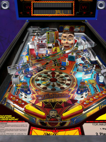
Look at the ramps on Theatre of Magic, Tales of the Arabian Night, and Funhouse, a lot better. The old tables where well done.
Look at the playfields, the atmosphere!

pinball-arcade-4-380x570.png

screen480x480.jpeg

screen480x480.jpeg
 

switch3flip

Member
Jan 30, 2013
944
0
I agree there certainly is room for improvement on cyclone, but to be fair it's a very flat and dull looking table in real life as well IMHO.
 

PiN WiZ

Mod & Forum Superstar
Staff member
Feb 22, 2012
4,158
1
Thanks for the feedback Baron and night. I've been very vocal about the inconsistencies of transparent ramps during betas. Some are touched up...others not so much. I'll continue to bring this to FarSight's attention every chance I get and hopefully something will change. I also fight hard for baked-in GI lighting as well which I believe is crucial for adding depth and atmosphere to the tables.
 

Robert Misner

New member
Oct 4, 2014
610
0
Ah Ok so what your talking about is the transparent ramps and stuff not the table itself..
As far as I can tell the rest of the table is accurate and looks as good as could be expected, but Yes their transparent/translucent material isn't great.

I've always thought the issue was they look like they have a Matt Finish vs abit of a shiny clear material. A transparent chrome material would probably look better
Zen does a really good job of making Plastic look translucent/clear with shiny highlights,abit over the top..but somewhere in the middle between the two ways of doing them would probably be a very realistic look.

OTXEHwI.jpg
 

canuck

New member
Nov 28, 2012
880
1
Thanks for the feedback Baron and night. I've been very vocal about the inconsistencies of transparent ramps during betas. Some are touched up...others not so much. I'll continue to bring this to FarSight's attention every chance I get and hopefully something will change. I also fight hard for baked-in GI lighting as well which I believe is crucial for adding depth and atmosphere to the tables.

IMO the perceptively poor transparencies appear to have been rushed....perhaps a touched up version will appear in the inevitable patch. It seems like Farsight fights to beat the deadline for release, but quality control then takes a back seat. ...Kind of like that missing disk in Adams Family initial release. I'm confident they'll fix it - and I'd rather have an imperfect table than no table at all. :)
 
Last edited:

Members online

No members online now.

Members online

No members online now.
Top