Enhanced version of the Star Trek: The Next Generation table on PS4 to be shown at E3

SKILL_SHOT

Banned
Jul 11, 2012
3,659
1
Is someone holding a flashlight over it? not impressed but at least they included the center ramp sticker this time :p
I thought the same about STTNG looks like the lighting is coming from above.
 

Mark W**a

Banned
Sep 7, 2012
1,511
0
Eat your heart out, Pro Pinball. Mother of God. It's beautiful. Stunning. Unbelievable.

Absolutely DRENCHED in color and that lighting is fantastic.

Ok anything negative ive said lately towards Farsight is taken back. What they are doing with PS4 is incredible. I can't stop staring at that screen. Holy crap. That lighting... That color....it... It looks better than real life!! Lol.
 

PiN WiZ

Mod & Forum Superstar
Staff member
Feb 22, 2012
4,158
1
Looks like the light source from above is too confined (like a single light bulb is hanging over the table) and too close to the table. Other than that, the overall presentation is vastly improved.
 

spoonman

New member
Apr 20, 2012
1,435
3
So does anyone think the improved fidelity on PS4 and PC versions of TPA will affect the current console tables in a positive way?
I.E.: Maybe they will be scanning the source table textures in high resolutions, with more care, or more post clean-up,
since the details, or lack there of will be more obvious on "next gen" versions?
 

karl

New member
May 10, 2012
1,809
0
I think the flashlight effect is there because only some of the inserts lights are on. The lights does not look 100% accurate but it still looks damn fine to me, and a big, big improvement. I think it is crazy to buy a new console just for one game but that is just what I will probably do :eek:.

I am hoping that some of the playfield textures (especially inserts) are higher resolution than on the pc version as it stands now. But no matter what happens, this will be a fantastic version, I can feel it :p
 

karl

New member
May 10, 2012
1,809
0
So does anyone think the improved fidelity on PS4 and PC versions of TPA will affect the current console tables in a positive way?
I.E.: Maybe they will be scanning the source table textures in high resolutions, with more care, or more post clean-up,
since the details, or lack there of will be more obvious on "next gen" versions?

That is a good question Spoonman and I hope the answer is a roaring YES
 

Tann

New member
Apr 3, 2013
1,128
1
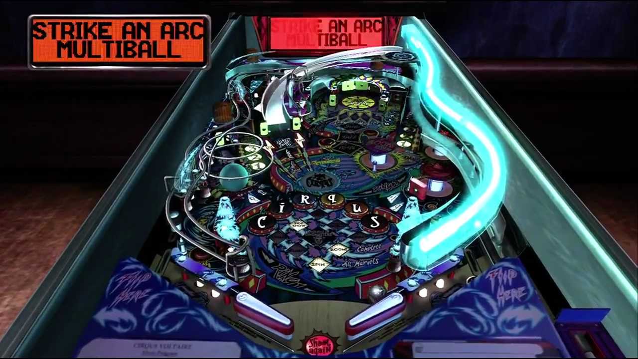
Well... It wasn't too difficult to improve Cirqus Voltaire, as it is one of the darkest and most messed up table in TPA PS3 version (except the neon FX):

PS3
maxresdefault.jpg


PS4
ebaac9180e11261353b524819a458c52


Whatever, it looks good (but I think PS3 version could be close to it, with some work...)
 
Last edited:

kimkom

Member
Jan 28, 2013
914
1
CV PS4 looks like an improvement but still WIP.

And the old low-res background remains. Moving forward, it would be nice to have at least a couple of different options for the environment background.
 

spoonman

New member
Apr 20, 2012
1,435
3
Well... It wasn't too difficult to improve Cirqus Voltaire, as it is one of the darkest and most messed up table in TPA PS3 version (except the neon FX):

PS3
maxresdefault.jpg


PS4
ebaac9180e11261353b524819a458c52


Whatever, it looks good (but I think PS3 version could be close to it, with some work...)

My thoughts exactly. At first glance it looks amazing, but only because we were used to much less.
Looking at it more objectively I would say the top pic 1 (PS3) could pass for an Xbox screen and pic 2 (PS4) for a PS3 screen.
A very nice looking PS3 screen though. :)

My biggest fear is that the PS4 versions will reuse some of the PS3 textures and many of those looked blurry if you zoom in at all.
Oh and they better get rid of those Flyers or start resolutions of 1920x1080.
 

Ark Malmeida

New member
Apr 3, 2012
360
0
My thoughts exactly. At first glance it looks amazing, but only because we were used to much less.
Looking at it more objectively I would say the top pic 1 (PS3) could pass for an Xbox screen and pic 2 (PS4) for a PS3 screen.

Strange statement since the 360 tables have consistently looked better then the PS3 tables (when they were being released that is).
 

shutyertrap

Moderator
Staff member
Mar 14, 2012
7,334
0
Strange statement since the 360 tables have consistently looked better then the PS3 tables (when they were being released that is).

Considering the PC beta is essentially the 360 version, I fall into the camp of PS3 looking better. Except for Taxi and BK. The HDR bloom is just too much for me, as well as the heavier pink tones.
 

brakel

New member
Apr 27, 2012
2,305
1
Strange statement since the 360 tables have consistently looked better then the PS3 tables (when they were being released that is).

That's what I thought! Even after they stopped releasing xbox packs we would still see xbox dev pics and videos. Then it would be released to PS3 and we'd wonder what happened? Hmm...something must have happened during the port! :p
 

Jim O'Brien

New member
Feb 28, 2012
361
0
All the lighting improvements aside the thing that really stands out with these pics for me is the detail in the habitrails and ramps very impressive.
 

Mark W**a

Banned
Sep 7, 2012
1,511
0
My thoughts exactly. At first glance it looks amazing, but only because we were used to much less.
Looking at it more objectively I would say the top pic 1 (PS3) could pass for an Xbox screen and pic 2 (PS4) for a PS3 screen.
A very nice looking PS3 screen though. :)
.

Very weird comment especially considering CV looks actually quite good on 360. And 360 games across the board look superior to the PS3 versions all generation.

I can't wait to buy a PS4 but it really irks me that I have to be on the same team now with these types *rolls eyes*.
 

Jeff Strong

Moderator
Staff member
Feb 19, 2012
8,144
2
Very weird comment especially considering CV looks actually quite good on 360. And 360 games across the board look superior to the PS3 versions all generation.

I can't wait to buy a PS4 but it really irks me that I have to be on the same team now with these types *rolls eyes*.

Dude, that last sentence is not needed. Some people are probably thinking the same thing about you after that comment.
 

brakel

New member
Apr 27, 2012
2,305
1
Very weird comment especially considering CV looks actually quite good on 360. And 360 games across the board look superior to the PS3 versions all generation.

I can't wait to buy a PS4 but it really irks me that I have to be on the same team now with these types *rolls eyes*.

Mark, you're not on my team! :D
 

spoonman

New member
Apr 20, 2012
1,435
3
Strange statement since the 360 tables have consistently looked better then the PS3 tables (when they were being released that is).

No.. you misunderstood me. I said XBOX, Not XBOX 360! :p

I said:
My thoughts exactly. At first glance it looks amazing, but only because we were used to much less.
Looking at it more objectively I would say the top pic 1 (PS3) could pass for an Xbox screen and pic 2 (PS4) for a PS3 screen.
A very nice looking PS3 screen though.

I was going to say the top pic could pass for a PS2 screen, but I thought it looked a bit better and went with Xbox since (in most cases with 3rd party games being released on both PS2 and Xbox, the Xbox had slightly better quality graphics (please no console wars!).


Anyway, I do think the PS3 lighting looks better on most. Sure there were a few duds (Black Knight, Harley, Taxi), but the majority of them looked fantastic on the PS3.. Gorgar, CFTBL, TOTAN, and Bride of Pin*Bot still impress me.
 
Last edited:

Members online

No members online now.

Members online

No members online now.
Top