-
Welcome Back to Digital Pinball Fans - please read this first
You are using an out of date browser. It may not display this or other websites correctly.
You should upgrade or use an alternative browser.
You should upgrade or use an alternative browser.
Game of Thrones - 14 big pics
- Thread starter invitro
- Start date


Well, I'm known as the "battering ram" at my local pleasure house...

karl
New member
- May 10, 2012
- 1,809
- 0
The same thing just crossed my mind. Hope it's there. The show is only a month away.
The Metropolis style backglass is such a huge improvement. I've also seen pictures of Genesis with clear ramps instead of the purple. Way more appealing to me.
From zero to hero. Love the metropolis version.
invitro
New member
- May 4, 2012
- 2,337
- 0
- Thread starter
- #64
The Metropolis style backglass is such a huge improvement. I've also seen pictures of Genesis with clear ramps instead of the purple. Way more appealing to me.
Is the Metropolis translite a fan job? There's no pic or mention of it on IPDB and I don't remember seeing it. There's one on this page, along with transparent ramps:
http://amigonetblog.blogspot.com/2014/05/genesis-1986-gottlieb-premier.html
Kolchak357
Senior Pigeon
- May 31, 2012
- 8,102
- 2
There was somebody selling them. Not sure who it was though. Here is one that still has them.
http://www.pinballwizard.nl/contents/en-us/d1129_translite_Genesis_pinball_Flipperkast_Gottlieb.html
I saw one at a pinball show and the new translite looked really nice in person.
Edit: Todd from TNT Amusements says they are available on eBay in one of his vids. Not sure if that is still the case though.
Last edited:
SoT most definitely has references to the TV show. I get that you guys don't like how it does its references. I'm not making any excuses at all for the GoT art. I just don't see how it's any worse than most other Stern or Sega games, going back twenty years.
Freres didn't do many duds, but he did do Hardbody, and he's listed as one of four artists on the 2013 Star Trek. I'll bet that Stern gives its artists much less time to do their work than Williams did, and Stern probably forces its artists to use computers, unless a time limit does that.
Hardbody and Party Animal are almost 30 years old, but you didn't say worst art in the last 30 years, you said worst ever. And their art is bad not because it's cheezy (cheezy isn't necesarily bad, I think?), but because it's so ugly that looking at it makes me feel nauseous. (I think GoT is pretty cheezy itself: it's about boobs, blood, and medieval stuff.)
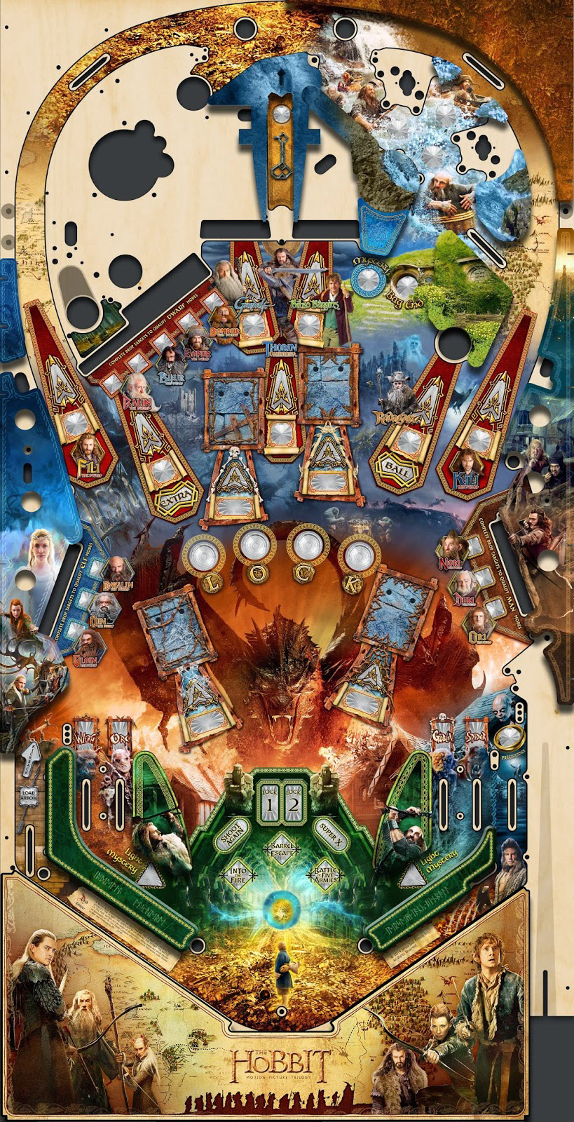
Any other pinball machine's art is a relevant comparison to GoT. I certainly agree that the GoT art is worse than the Hobbit art that I've seen (but not by a lot), but you guys are making some claims that are much stronger, like being the worst art to ever deface a pinball machine
I've been depressed over the state of pinball art for 15 years, at least since WMS died, and also for the Sega tables that were a little more ignorable because I could play the WMS beside them. So I'm very glad to see an outcry about GoT. I just don't understand why an outcry about Stern art in general didn't come sooner... it's probably too late to go back to hand-drawn playfield art now (other than limited editions, and I mean hand-drawn everything, including letters and numbers).
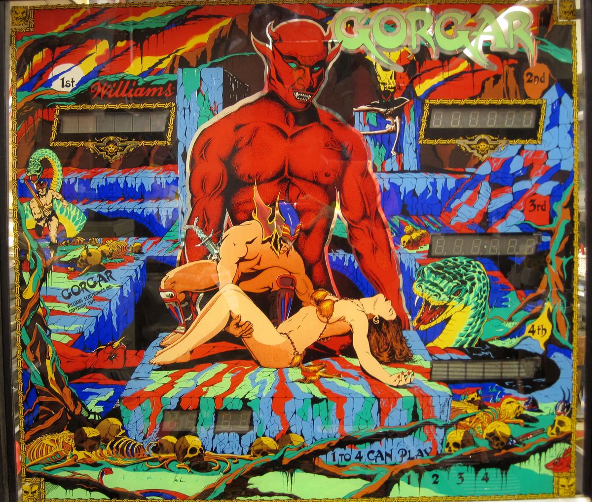
Just checked out Party Animals and it isn't appealing, but it has better art than GoT. Its art at least matches the theme and actually has some artistic skill and effort put into the illustrations. Genesis above is pretty ugly and almost colorless, but at least shows a lot of attention to detail in the illustration and shows that work was put into it. They aren't pretty, but I'd definitely say both did a better job than GoT. GoT shows almost no effort or attention to detail put into it, it's practically the definition of a phoned in photoshop job. But to make it even worse it has almost nothing specifically associating it with the show and it's theme. The gears that you could argue are part of the theme, but only because they use them in the opening sequence. They are still completely off the mark thematically. Then the art left over is so generic and poorly done that if you weren't told what it was licensed after you wouldn't have any idea.
Yes there are lots of bad tables with bad art, including the Sega's and modern Sterns, but I can't think of any others this bad that also don't even reference their own theme. Starship Troopers is pretty terrible, but at least you can tell what it is when you look at it. So yeah, I'm not saying it's the worst ever, but I can't think of anything that is actually, truly worse off the top of my head. And if we have to actually go digging to look for one that's worse then that really says it all.
As for the Hobbit I thought the first playfield was truly horrendous (I made a topic about it here the day it was shown). I absolutely hated it. But as bad as it was that first Hobbit art was still miles ahead of what GoT looks like. Then the new, current Hobbit artwork is so much better there isn't even a comparison. The Hobbit playfield art makes GoT look like it isn't even an actual real pinball table.

Last edited:
invitro
New member
- May 4, 2012
- 2,337
- 0
- Thread starter
- #67
I have no disagreement that GoT is a cheap photoshop job... I just claim that almost all Stern/Sega tables are cheap photoshop jobs.GoT shows almost no effort or attention to detail put into it, it's practically the definition of a phoned in photoshop job.
...
And if we have to actually go digging to look for one that's worse then that really says it all.
Then the new, current Hobbit artwork is so much better there isn't even a comparison. The Hobbit playfield art makes GoT look like it isn't even an actual real pinball table.
I might consider the lack of reference to GoT on the PF a plus.
We don't have to dig for worse ones... I just chose the two worst I could quickly remember to counter the claim that the backglass was the worst of all time.
That Hobbit playfield actually looks worse than the GoT PF to me. The Hobbit I somewhat praised above must be a different animal. This one is horrific... yikes.


- May 8, 2012
- 4,334
- 3
The pro is RRP AUD$8.5KSo they'll buy the Premium and Stern will make more money. That's probably the idea
Ain't no operator gonna buy a premium for over $10k and expect to make a fair return.
Looks like no upper playfield on the pro, but at least you get drop targets...

No one except maybe Timezone Gold Coast.
Apparently the owner of that mega center knows Gary personally. That's why they can Air freight tables out before the authorised distributor gets them.
- May 8, 2012
- 4,334
- 3
$2 in the colonies.I haven't played a machine in the wild for a long time. Is it really a buck per play now days?
- May 8, 2012
- 4,334
- 3
Wow. Just, wow. This looks like a giant whiff to me. The pro version just looks like it is missing stuff, especially the upper left corner. The lame pic of the white walker on the back panel, there's just no context with the game. Then you look at the LE version, and it totally doesn't look like the same game. Problem is, the whole Kings Landing castle (?) looks so clunky. Or is that supposed to be where Danerys is? When you compare this to other older fantasy themed pins, this just looks so generic. What a shame. Shouldn't try and squeeze all 8000 pages of books, 5 seasons of TV, into one pin.
I know some people are complaining about the gear art on the table. Honestly, they would have been better off embracing that look in totality as the opening credits give the nice broad sweep of the entire story in such a small package. This instead looks like design by committee.
Swords of Fury is better than this. Just cut the BK2K playfield in half and slap it on Swords and you'd have a GoT Stern beater.
The GoT upper is just a glorified lock mechanism feed.
EldarOfSuburbia
New member
- Feb 8, 2014
- 4,032
- 0
Swords of Fury is better than this. Just cut the BK2K playfield in half and slap it on Swords and you'd have a GoT Stern beater.
The GoT upper is just a glorified lock mechanism feed.
Give me The Shadow's upper playfield any day ...
Tann
New member
- Apr 3, 2013
- 1,128
- 1
GoT shows almost no effort or attention to detail put into it, it's practically the definition of a phoned in photoshop job. But to make it even worse it has almost nothing specifically associating it with the show and it's theme. Then the art left over is so generic and poorly done that if you weren't told what it was licensed after you wouldn't have any idea.
This.
Daniel Osborne
New member
- Feb 28, 2012
- 422
- 0
Stern playing it safe and being lazy. It looks like ****e and they're still using the dmd ffs. Not impressed in the slightest. Totally ridiculous when you figure how much it's going to cost. They're hoping it's going to sell on the name alone, I can't believe how poor this looks.
karl
New member
- May 10, 2012
- 1,809
- 0
And 15 years being alone in the business So no competition. They could do it their way.
It's a pity that Stern never show how many units they sell, though.
By now I'm just hoping that got will play well and have well thought out rules. After all, that is the most important thing for me as a pinball player.
The problem with bad art like this is that they are probably missing out on a lot of the extra revenue that the theme would otherwise have brought in. People that are massive fans of the show or those seeing it in a bar for the first time who are not into pinball. Or maybe I am just exaggerating the role artwork plays in pinball here.
Stern have always let the art play second fiddle. They used to have extremely low resolution on their print. Just go up close to something like Tron for instance. It is really horrible print quality.
They have also had a lot of complaints about sloppy work when applying the decals lately.
On the plus side, I am really happy that they finally did something with the flipper hums. Buying a NIB pinball machine and getting horrible flipper noise right out of the box was really not very attractive. (it happened with 2 of the 3 nib games I have bought)
So no competition. They could do it their way. It's a pity that Stern never show how many units they sell, though.
By now I'm just hoping that got will play well and have well thought out rules. After all, that is the most important thing for me as a pinball player.
The problem with bad art like this is that they are probably missing out on a lot of the extra revenue that the theme would otherwise have brought in. People that are massive fans of the show or those seeing it in a bar for the first time who are not into pinball. Or maybe I am just exaggerating the role artwork plays in pinball here.
Stern have always let the art play second fiddle. They used to have extremely low resolution on their print. Just go up close to something like Tron for instance. It is really horrible print quality.
They have also had a lot of complaints about sloppy work when applying the decals lately.
On the plus side, I am really happy that they finally did something with the flipper hums. Buying a NIB pinball machine and getting horrible flipper noise right out of the box was really not very attractive. (it happened with 2 of the 3 nib games I have bought)
Last edited:
The problem with bad art like this is that they are probably missing out on a lot of the extra revenue that the theme would otherwise have brought in. People that are massive fans of the show or those seeing it in a bar for the first time who are not into pinball. Or maybe I am just exaggerating the role artwork plays in pinball here.
I don't know what the percentage is, but it matters. For example I wasn't interested in GoT even though I really like the show, but had it had fantastic artwork there's a chance I might have bought one. As it is there is zero chance I'll get it. Alien Pinball is another example. The interesting playfield/shot map they released made me pay attention, but it's because of the fact that I found out Aurich is doing the artwork that I'm putting a deposit on one today. Not only that, but if the art turns out bad or I just don't like it I'll cancel my deposit regardless of how good it looks to play.
invitro
New member
- May 4, 2012
- 2,337
- 0
- Thread starter
- #80
They drove WMS pinball out of business with this strategy from 1995-1999. I think? I actually don't know why WMS failed while Sega succeeded, but I think it's because Sega said only two things matter: "coolness" of license, and price. I think WMS made a horrible mistake with Pinball 2000 also, but they were probably doomed before that.And 15 years being alone in the business
...
The problem with bad art like this is that they are probably missing out on a lot of the extra revenue that the theme would otherwise have brought in. People that are massive fans of the show or those seeing it in a bar for the first time who are not into pinball. Or maybe I am just exaggerating the role artwork plays in pinball here.
I think Stern knows what they're doing, and that most people who are massive fans of the TV show will not care about the art. Again, the GoT is no worse than standard Stern art, and such art has worked for Sega/Stern for a very long time now.
I don't think you're at all exaggerating the role art plays in pinball. Art is super important to whether I think a table is a good one. But I think you're exaggerating the role art plays in the sales aspect of pinball. It is depressing, but artistic quality of nearly everything - movies, music, books - has declined to almost zero in the last 20 years, with not much effect on sales. It's a general cultural trend, I think. Hopefully art will eventually make a comeback.