Haunted House Gameplay Video

Nightwing

Active member
Aug 1, 2012
1,139
1
The vid is currently unavailable.. very curious.

The video is working just fine for me.

As to the other questions...

That MS version is impressive,considering its age....

Also,I just have happened to have taken pics a couple of weeks ago of an actual HH table (the one being readied for play at TPWA) and I agree about the lower playfield being more trapezoidal. You can see though - the TPA gameplay is at a much lower angle than the old MS one. Maybe it will look more proper at an higher angle?

I'll post the HH pic later at some point when I have the extra time...
 

night

New member
May 18, 2012
2,109
0
This looks very good, definitely not the grey stuff we saw in the screenshot topic before. Nice sound fx! I feel like a kid again. I hope it will look good on the mobiles as well, can't wait to play this game. :)
 

vpalmer

New member
Aug 18, 2013
584
0
colors look much better than on screenshots.
maybe low playfields' borders looks rectangular because of perspective distortions, but digits on low playfield must be close to each other for sure.
 
Last edited:

lettuce

New member
Mar 17, 2012
1,086
0
Yeah colours still seem very muted compared to the PC version im currently playing atm. Maybe FS should try using a different capture software as it seems to kill the colours
 

atlantis1982

New member
Nov 23, 2012
360
0
Sucks that ps3 owners have to wait 3 months for this. Looks awesome

>.> Sucks worse for the 360 players...

:ahem:

Never did played this table, nor the Microsoft (segway!) Pinball Arcade games, but this definitely looks fun to play. 80s tables are so under-appreciated. :(
 

Mark W**a

Banned
Sep 7, 2012
1,511
0
It looks nice, but isn't the basement window supposed to be more of a trapazoid shape instead of a rectangle?

I still think the Microsoft version holds up very well from 15 years ago

Yeah this looks amazing.

I'm sure it's probably low res 480P or something based on age, but damn visually it doesn't get more realistic looking than that.

And people saying MSPinball has bad physics? Sure I see a couple quirks here and there but for the most part that looks absolutely phenomenal and again ultra realistic.

Just listen to the sound package too little touches like when the ball hits the flipper sounds EXACTLY like real life.

Have to say I'm going to download this. Farsights version looks ok and par for the course for thier engine, but I'm sure it's going to play too fast just like Black Hole, Flight 2000, Centaur are way too fast.

Man id love to see what the folks behind MS Pinball could do today. You have to admit even 15 years later pre-rendered > 3D polygons: we are still a ways away from photo-realism even on next generation consoles and PCs.
 

Mark W**a

Banned
Sep 7, 2012
1,511
0
The colorblind people must be working in preproduction. Most of the pink is gone but still some on the pop bumpers and drops especially in the lower play field. Otherwise it looks great.
 

mpclemens

New member
Jun 26, 2013
133
0
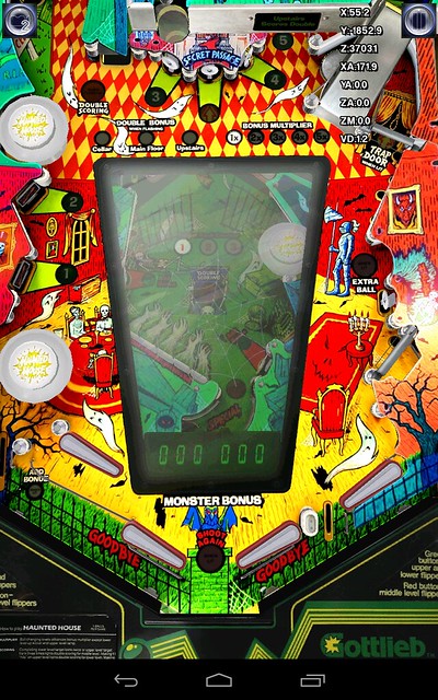
It looks nice, but isn't the basement window supposed to be more of a trapazoid shape instead of a rectangle?

It is, don't panic. This is as near as I could get to a directly-overhead screenshot from the pre-beta Android release. Don't freak out about the colors. This was a performance test, and we've been told that art issues are being resolved. I'm sure there'll be time enough to freak out after the real beta drop.


HH Screenshot_2013-09-21-10-07-37 by mpclemens, on Flickr

It's very clearly a trapezoidal shape.
 

lettuce

New member
Mar 17, 2012
1,086
0
Damn!! how are you able to manually change the camera view like that!??. Would love to be able to do that on the PC beta and then spin my monitor around!
 

mpclemens

New member
Jun 26, 2013
133
0
Damn!! how are you able to manually change the camera view like that!??. Would love to be able to do that on the PC beta and then spin my monitor around!

Found it by accident. I suspect it's a bit of debugging code that will be removed, but double-tapping on the pause button gives you camera control. I say it's debugging code, since you can scroll down through the table and beneath the floor, too. I imagine FS uses it to determine the coordinates for optimal camera placement (see the display in the upper right corner.) I was hoping to discover Easter Eggs, but so far all I've found out is that the gopher on the top of the Tee'd Off backbox looks more like a teddy bear than a rodent. :)
 
Last edited:

lettuce

New member
Mar 17, 2012
1,086
0
Found it by accident. I suspect it's a bit of debugging code that will be removed, but double-tapping on the pause button gives you camera control. I say it's debugging code, since you can scroll down through the table and beneath the floor, too. I imagine FS uses it to determine the coordinates for optimal camera placement (see the display in the upper right corner.) I was hoping to discover Easter Eggs, but so far all I've found out is that the gopher on the top of the Tee'd Off backbox looks more like a teddy bear than a rodent. :)

So are you able to position the camer so its directly above the playfield and fits the whole table in??
 

mpclemens

New member
Jun 26, 2013
133
0
So are you able to position the camer so its directly above the playfield and fits the whole table in??

Sort of. And it's not a live camera -- the game is paused. The pre-beta camera settings are little wonky right now, but there's usually one of the four that's a top-down mode. I would expect FS to set up the same for HH.
 

rob3d

New member
Feb 20, 2012
478
0
Found it by accident. I suspect it's a bit of debugging code that will be removed, but double-tapping on the pause button gives you camera control. I say it's debugging code, since you can scroll down through the table and beneath the floor, too. I imagine FS uses it to determine the coordinates for optimal camera placement (see the display in the upper right corner.) I was hoping to discover Easter Eggs, but so far all I've found out is that the gopher on the top of the Tee'd Off backbox looks more like a teddy bear than a rodent. :)

I remember this from back when TZ was 1st released. It used to be triggered by a swipe down from the pause button. Glad its made a return.
 

Mark W**a

Banned
Sep 7, 2012
1,511
0
It is, don't panic. This is as near as I could get to a directly-overhead screenshot from the pre-beta Android release. Don't freak out about the colors. This was a performance test, and we've been told that art issues are being resolved. I'm sure there'll be time enough to freak out after the real beta drop.


HH Screenshot_2013-09-21-10-07-37 by mpclemens, on Flickr

It's very clearly a trapezoidal shape.

This looks great. I saw the Android beta and it's too dark. You can't just all of a sudden start doing dark tables IMO after the past 35 tables have all been bright, colorful and vibrant.
 

Members online

No members online now.

Members online

No members online now.
Top