- Mar 14, 2012
- 7,334
- 0
What is it about the scrolling through 65 tables UI that you like so much? Is it purely because you an image of the backglass?
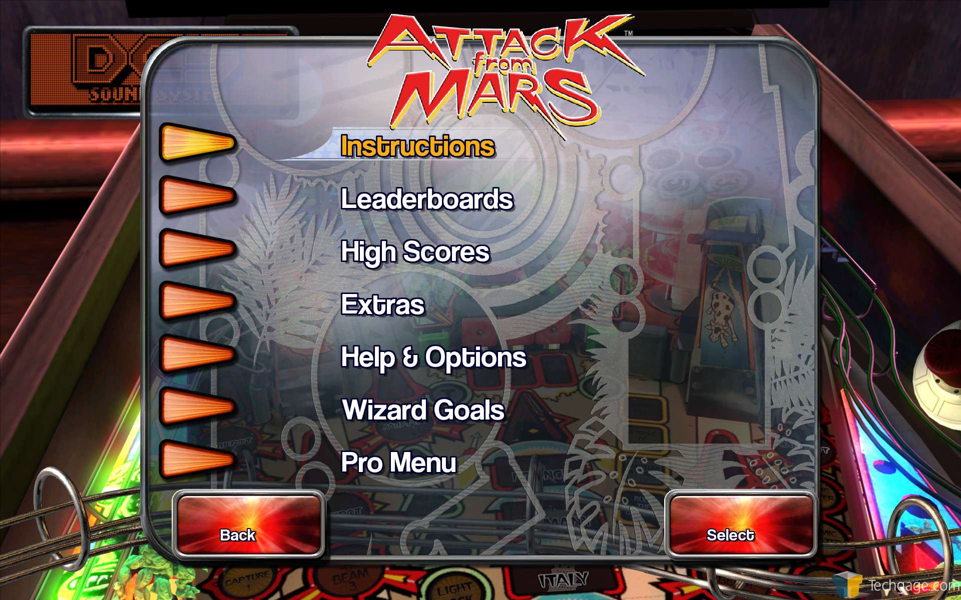
The new UI is so much quicker for selecting tables. Once you select the table, you actually get a window that shows the full machine, like people were asking for. Plus you can sort! It's clear as a bell which table is the free table of the month, which is brand new. I just seriously do not get the hate. I've been using the new UI for a while now. Now and then they'd pull it, and I'd have to go back to using the old one, and the limited functionality of it just sticks out. It's like trying to go from DX11 back to DX9.
The new UI is so much quicker for selecting tables. Once you select the table, you actually get a window that shows the full machine, like people were asking for. Plus you can sort! It's clear as a bell which table is the free table of the month, which is brand new. I just seriously do not get the hate. I've been using the new UI for a while now. Now and then they'd pull it, and I'd have to go back to using the old one, and the limited functionality of it just sticks out. It's like trying to go from DX11 back to DX9.
")

