Black Knight 2000 Screenshots

Pinballwiz45b

Well-known member
Aug 12, 2012
3,681
34
1899676_693529860668077_410917313_o.jpg


1599636_693529864001410_1435065516_o.jpg


1518112_693529867334743_1736704388_o.jpg
 

lettuce

New member
Mar 17, 2012
1,086
0
For the love of god FS change the damn environment textures that floor texture is horribly low resolution, looks like a Wii/PS2 texture!

But the actual table looks great!...but the disconnect from that quality to the environment is becoming very jarring
 

DrainoBraino

New member
Apr 11, 2012
634
0
Well, it's the same issue as with BR, the mobile versions do have much better colors than the consoles, this is too brown/orange imo. But it's a fine looking table nonetheless.
Yep it has the same brownish thing going on that the screens from Black Rose had. Farsight has made the shift from pink to brown.
 

p6800

New member
May 17, 2013
222
0
As others have said before, this just doesn't look right. :(

Seems lifeless and dull. Why can't they get it right on this powerfull platform, the pc? Feels like going backwords...
 

lettuce

New member
Mar 17, 2012
1,086
0
As others have said before, this just doesn't look right. :(

Seems lifeless and dull. Why can't they get it right on this powerfull platform, the pc? Feels like going backwords...

Its to do with the way the lighting is done, on all system at the moment (bar the PS4) the lights are just another texture placed over the light off texture but on the PS4 there are actual lights under each decal on a table and give off and reflect their own light, which will give a much better look
 

kimkom

Member
Jan 28, 2013
914
1
Looks good. With the addition of some shading and shadows this will look a lot better. Hopefully those will be added before release.

One table per month now FarSight. There's no excuse not to make these tables sing.
 

p6800

New member
May 17, 2013
222
0
Its to do with the way the lighting is done, on all system at the moment (bar the PS4) the lights are just another texture placed over the light off texture but on the PS4 there are actual lights under each decal on a table and give off and reflect their own light, which will give a much better look

But how is it that the android version has a very different look and feel? The colors are much beter!

Here, let's have a look and compare.

http://postimg.org/gallery/739v5df4/
 

Rudy Yagov

New member
Mar 30, 2012
836
0
The colors are brighter on android, but the table overall looks much smoother and more detailed in the PC screenshots.
 

Jeff Strong

Moderator
Staff member
Feb 19, 2012
8,144
2
I'm glad it's not as bright as mobile. I normally don't play pinball under a spotlight. :)

Now if we could just get the PS4 "dark" setting on PC....
 
Last edited:

night

New member
May 18, 2012
2,109
0
I'm glad it's not as bright as mobile. I normally don't play pinball under a spotlight. :)

Now if we could just get the PS4 "dark" setting on PC....

The tables on the mobiles arn't really any brighter compared to the mobile version, it's the colors that are fresher, put 'm side by side. The console's playfield lighting fx is the only advantage here. You can't say of the last 2 mobiles tables they look like they where lit by a spotlight. They look far better color-wise.
 
Last edited:

Jeff Strong

Moderator
Staff member
Feb 19, 2012
8,144
2
The tables on the mobiles arn't really any brighter compared to the mobile version, it's the colors that are fresher, put 'm side by side. The console's playfield lighting fx is the only advantage here. You can't say of the last 2 mobiles tables they look like they where lit by a spotlight. They look far bette color-wise.
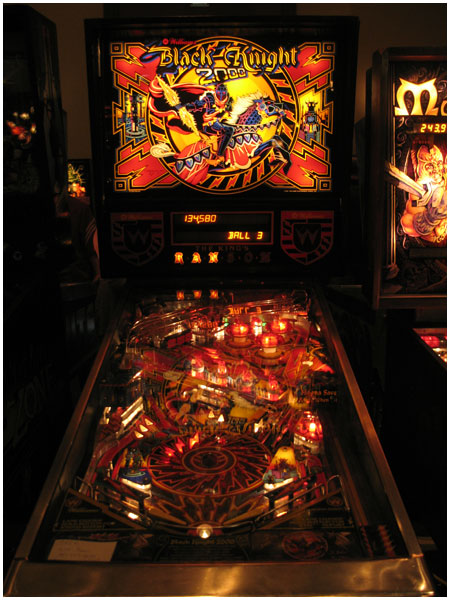
Yes, I can say it...

See below for the colors I'd prefer...at least the above images are closer to this, unlike the mobile which does look like it's under a spotlight in comparison:

pinballExpo2010_18.jpg
 
Last edited:

Members online

Members online

Top