Pinballwiz45b
Well-known member
- Aug 12, 2012
- 3,681
- 34


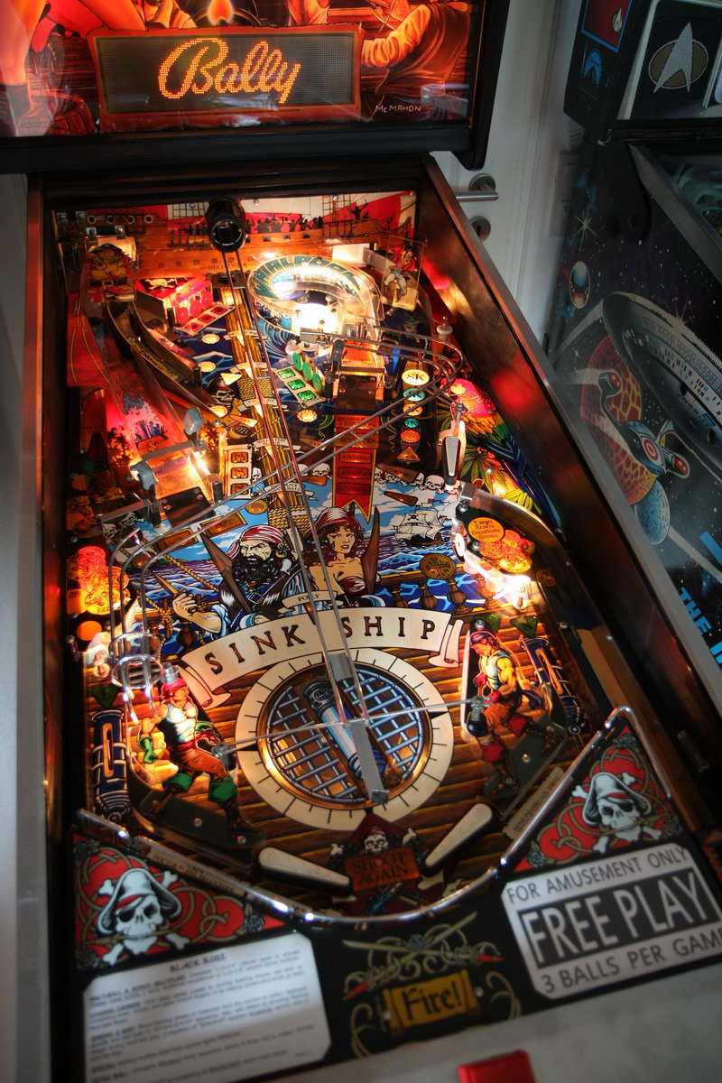
I know most everyone likes to view the playfield in portrait mode, so I tried something different now that the table has been officially announced. I stitched together a bunch of screenshots from table explore mode to give full view of the playfield; there's one extra back button by the L Flipper but it doesn't really impact the viewing of things.
Black Rose Explored 9.72 MB PNG
What a truckload of orange environmental light.. like someone put an orange filter in front of the camera. First pink, now orange. All the rest looks great.
What are you talking about!. The majority of the table is either a brown, orange or redish colour so of course your going to get a orange glow from the table. I sometimes think a lot of members here have never stood at a real pinball table in the wild, ie in a poorly lit arcade or bar!.

Instead of VP, might as well compare to the real thing...which actually looks quite orange
Jeff, I do a lot of 2D and 3D artwork, I know what happens when environmental lighting changes. Your vid is of course a very different example, exellent for a night modus. Zaccaria does a lot of dim light environmental artwork, but it succeeds to keep it's color not covered in an ooze of blue, pink or orange very well.
But if everbody is happy with the colors, then there is no problem, right?