New UI Public Beta

shutyertrap

Moderator
Staff member
Mar 14, 2012
7,334
0
What is it about the scrolling through 65 tables UI that you like so much? Is it purely because you an image of the backglass?

The new UI is so much quicker for selecting tables. Once you select the table, you actually get a window that shows the full machine, like people were asking for. Plus you can sort! It's clear as a bell which table is the free table of the month, which is brand new. I just seriously do not get the hate. I've been using the new UI for a while now. Now and then they'd pull it, and I'd have to go back to using the old one, and the limited functionality of it just sticks out. It's like trying to go from DX11 back to DX9.
 

rehtroboi40

New member
Oct 20, 2012
1,668
0
What didn't you like about it? Were you using DS4 Windows? I cannot tell a difference between the 360 controller and the PS4 in terms of button latency or movement. I happen to vastly prefer the Dual Shock layout, which is why I'm even using the PS4 controller at all. Functionally though, the basics are the same.

DS4 Windows does pretty much nothing for it and doesn't even work in TPA. At least DS4 is not malware like the PS3-to-PC controller programs. While I also prefer the PS controller layouts and durability, they simply will never work well with PC-no matter the hacks. Way too hit-or-miss for me.
 

shutyertrap

Moderator
Staff member
Mar 14, 2012
7,334
0
DS4 Windows does pretty much nothing for it and doesn't even work in TPA. At least DS4 is not malware like the PS3-to-PC controller programs. While I also prefer the PS controller layouts and durability, they simply will never work well with PC-no matter the hacks. Way too hit-or-miss for me.

Um, I'm using DS4 Windows and it works perfectly for me with TPA and Zen. I am using it connected with USB, not wireless. Also on Win10. I have 2 different configs, swapping d pad for analog stick.
 

Metalzoic

New member
Jun 8, 2012
907
0
What is it about the scrolling through 65 tables UI that you like so much? Is it purely because you an image of the backglass?

The new UI is so much quicker for selecting tables. Once you select the table, you actually get a window that shows the full machine, like people were asking for. Plus you can sort! It's clear as a bell which table is the free table of the month, which is brand new. I just seriously do not get the hate. I've been using the new UI for a while now. Now and then they'd pull it, and I'd have to go back to using the old one, and the limited functionality of it just sticks out. It's like trying to go from DX11 back to DX9.

I don't particularly love the current one, it's more that the new one is a big step back overall. I also don't see the current one much as I pick my TPA table from a different front end that then it automatically goes and navigates the TPA menu and launches the table for me. That entire front end will break as soon as the new UI comes out forcing me to use the new UI and a keyboard since they seem to have made the new controls convoluted. That's my biggest issue.

But even when using the current UI directly, scrolling through the tables to the one you want only takes a few seconds so I really see no actual benefit to that being quicker. Especially when it means needing to click on tiny icons that exist in a horridly ugly UI. The filters and things are nice (although I think mostly unnecessary), but when I tried it were laid out in a drop down box that was poorly designed, placed and thought out. The filters could also easily have been added to what we already have without making it all uglier and less "pinball" looking. The other buttons and icons were scattered about in a nonsensical way that almost seems like they really didn't invest any thought or skill into it.

I don't know. I had the opposite reaction from you going from the current to the beta was like going from a finished product to a student project. Overall I just think the layout and controls of the current one are simple, fast, work well, and only rely on the keyboard which is what is needed to be able to integrate it into a keyboarder encoder that runs all a cabinets controls.
 

shutyertrap

Moderator
Staff member
Mar 14, 2012
7,334
0
I do find it a bit funny to be mad at FarSight for implementing something that does not work with your 3rd party front end. Not saying it doesn't suck, but it is kinda funny. Like getting mad that the new speed radar cops are using isn't being detected by your fuzz buster.
 

Metalzoic

New member
Jun 8, 2012
907
0
I do find it a bit funny to be mad at FarSight for implementing something that does not work with your 3rd party front end. Not saying it doesn't suck, but it is kinda funny. Like getting mad that the new speed radar cops are using isn't being detected by your fuzz buster.

Ha! True, but at the same time if the new UI were actually a well done improvement over the old than I'd probably be fine using it manually instead of having the current front-end auto-navigate the UI for me.
Unfortunately I'm losing the auto-navigating front end and getting stuck with a UI that's a step backward from the current. (in my opinion).

Hopefully I and some others will be able to re-write the module to hide and auto-navigate this new UI too, but who knows how long and how many hours work it will take to get it done.
 

Tann

New member
Apr 3, 2013
1,128
1
The filters could also easily have been added to what we already have without making it all uglier and less "pinball" looking.

+1. Why not have kept the current menu design (colors, objects like the habitrail, the orange light arrows) and added the new presentation (tiles) and new features (with some resizing tweaks)?

the_pinball_arcade_02.jpg


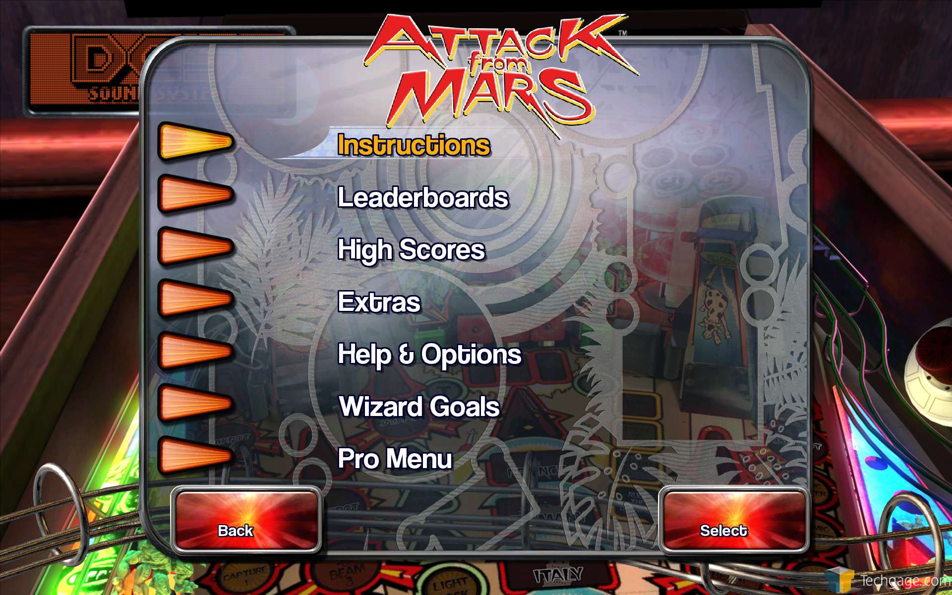
These gloomy grey and flashy blue are uglier than the ugliest 90's DVD menu, and are so far from pinball looking/nostalgia.

08CF341AAE1C70577658790A0CDF56E0897E7DF7


Shutyertrap said:
Once you select the table, you actually get a window that shows the full machine, like people were asking for.

At least, one good news. ;)
 
Last edited:

Xanija

Moderator
Staff member
May 29, 2013
1,348
0
By the way - this is going to be a running gag for the next few newsletters, or:

New User Interface

We are very proud to announce that the new Pinball Arcade User Interface will be releasing to the public next week for Steam.

We had it in Newsleter 49 (26.03.) & 50 (23.04.)

Or has FarSight adapted Valve_Time?

Sorry, couldn't resist. I'd rather have it late and ready, but those promises have quite a history with FarSight ;-)
 

paul.strauss

New member
Jan 3, 2015
8
0
I'm looking forward to trying out the new UI, but I'd really just like command line access to individual tables so I could consolidate all my games under a single front end like PinballX.


Sent from my iPhone using Tapatalk
 

Spork98765

Member
Jul 3, 2015
363
0
Shutyertrap said:
Once you select the table, you actually get a window that shows the full machine, like people were asking for.

Not really.
The "window" you're talking about exists in the old UI, it is the screen with the start button etc. on it; otherwise known as the attract mode screen. The view of the machine that has been requested is the one that is seen when the table is selected on the table select carousel but before you go to the actual start screen where you can adjust game options, or start the game. This, and the backglass icon when compared to the fugly ball tile icon are just some of the art selection complaints about the development selections with the UI.
 

Tann

New member
Apr 3, 2013
1,128
1
Not really.
The "window" you're talking about exists in the old UI, it is the screen with the start button etc. on it; otherwise known as the attract mode screen. The view of the machine that has been requested is the one that is seen when the table is selected on the table select carousel but before you go to the actual start screen where you can adjust game options, or start the game. This, and the backglass icon when compared to the fugly ball tile icon are just some of the art selection complaints about the development selections with the UI.

Oh... thanks for the clarification. I also understood that shutyertrap meant the full table image displayed on the right of the scrolling menu in the old UI.

screen480x480.jpeg


So, this nice touch is definitely missing in the new UI. Sad. :(

EDIT: finally, shutyertrap was talking about the same thing (the full table image, like in the old UI). See below.

Nice, then. ^^
 
Last edited:

shutyertrap

Moderator
Staff member
Mar 14, 2012
7,334
0
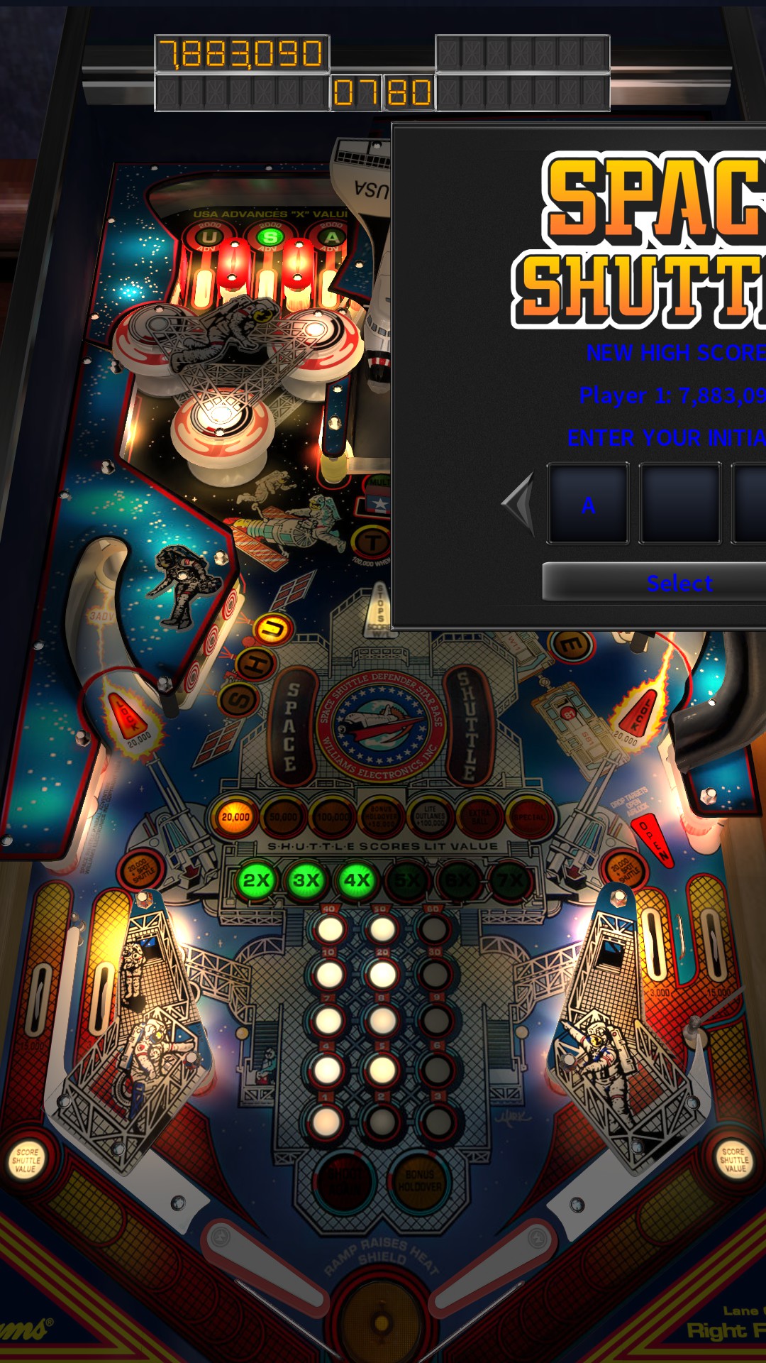
Here is what I was talking about. You are on the page with all the tiles of tables. You select your table, and this pops up:

D5C4424B56231AEFEB7AD74D6B17C083B7AA3056


From there it goes to the table view with your ball choices in the lower left and the options menu top center.
 

Spork98765

Member
Jul 3, 2015
363
0
Here is what I was talking about. You are on the page with all the tiles of tables. You select your table, and this pops up:

http://images.akamai.steamuserconte...825/D5C4424B56231AEFEB7AD74D6B17C083B7AA3056/
From there it goes to the table view with your ball choices in the lower left and the options menu top center.

That's new, I last loaded the beta UI maybe 4-5 days ago and I didn't see it then. Previously it was just the tiles and the start button in the bottom right corner that took you to the attract mode.

ETA: Just initialized TPA and the UI Beta on my new laptop and my biggest beef right now isn't limited to the new UI; in game settings aren't being saved at all.

Disable the menu music, next time you start TPA it's back on. Start a table and the camera is right back to view 1 unlocked etc. Files are all verified and no other game I copied over from my other computer is having any problem so it's a TPA issue. No surprise there.
 
Last edited:

EldarOfSuburbia

New member
Feb 8, 2014
4,032
0
Here is what I was talking about. You are on the page with all the tiles of tables. You select your table, and this pops up:

D5C4424B56231AEFEB7AD74D6B17C083B7AA3056


From there it goes to the table view with your ball choices in the lower left and the options menu top center.

That's actually quite good. Now if the made the sorting less clunky (and actually made it a filter and not just a sort), this would be... if not gold, then at least dull bronze. It's definitely improved since my first attempts to use it way back. Still not perfect but neither is the "old" UI.
 

John R. Martin

New member
May 11, 2014
22
0
UI Beta bugs:

1) At least in 2 games, Victory and one other (just forgot which one the other is), when you play more than 1 player, on ball 3 after the 1st player's ball is done, it goes into entering their initials, and then it leaves the select screen for initials on the screen, you can not play the remaining players balls, only the plunger will work.

2) In tournament mode, it doesn't say what tables are in the current tournament; and when you finish playing the game, upon exit it still plays the games soundtrack instead of the UI soundtrack.

Pros:

Only real pro I see to the new UI is the option to play a random table, and the layout of all tables by scrolling through. Game play is slightly quicker as well.
 

Metalzoic

New member
Jun 8, 2012
907
0
That's actually quite good. Now if the made the sorting less clunky (and actually made it a filter and not just a sort), this would be... if not gold, then at least dull bronze. It's definitely improved since my first attempts to use it way back. Still not perfect but neither is the "old" UI.

That's the same full-sized table and backglass art that we already have in the Current UI, except now it's smaller and in a little, ugly gray box.
 

greatdane

New member
Feb 19, 2015
49
0
On the latest beta build:
The filter menu does not look and work correctly on resolutions above 1920x1080. It starts "hovering" above the bottom menu line with options missing in the list.

Hope this one will get fixed in the release version. Otherwise I can't really use those cool new filters.
 

Xanija

Moderator
Staff member
May 29, 2013
1,348
0
By the way - this is going to be a running gag for the next few newsletters, or:

New User Interface

We are very proud to announce that the new Pinball Arcade User Interface will be releasing to the public next week for Steam.

We had it in Newsleter 49 (26.03.) & 50 (23.04.)

Or has FarSight adapted Valve_Time?

Sorry, couldn't resist. I'd rather have it late and ready, but those promises have quite a history with FarSight ;-)

Can't wait for the Newsletter 51 to see, if we find this:

We are very proud to announce that the new Pinball Arcade User Interface will be releasing to the public next week for Steam.

;)
 

Blueshirt

New member
Nov 17, 2012
40
0
As much as I like the new UI (not perfect, but a major improvement), it's really hard for me to play right now. The game hard crashes about every other goal I complete, for seemingly no reason. No other crashes besides this, it's just every other or so goal completed will hard crash. So going for achievments is rolling the dice on whether I can play or not. Hopefully this is fixed soon...
 

Members online

No members online now.

Members online

No members online now.
Top