New UI Public Beta

Crawley

Member
Mar 25, 2013
706
4
Of which you only need half. Seriously they should offer seperarte downloads for dx9 and dx11. Or give away free ssds

I'd be down for separate DX9 and DX11 downloads as I'm only playing in one of those versions and I would imagine most people don't switch between the two.
 

MisterVercetti

New member
May 26, 2015
37
0
One thing I noticed immediately is that the Tournament option is now gone. Will that only appear whenever a tournament is active, or is that just something that's forthcoming?
 

zmcvay

Member
Sep 19, 2014
356
5
Couldn't see if this has been asked, but is there a reverse sort option? Handier to have the tables I need to complete goals on at the top rather than the bottom.

One suggestion for a future update, when selecting goals, year or manufacturer as a sort option, it would be nice to have that info appear on the table icons.
 

Phaze

New member
Nov 5, 2013
7
0
Some feedback regarding the new interface.

- The iconography used for some buttons is not immediately obvious what it does, which results in alot of blind pressing of buttons to figure out what they do. Would prefer if buttons were labelled.

- The game setup option for selecting player count should be on the main screen after selecting a pinball machine (like old UI), not tucked away in a menu.

- Playing PC version with Xbox 360 controller, when the prompt comes up for the next player, it requires you to press B rather than A which is confusing.

- When entering high score initials on PC version with Xbox 360 controller, scrolling letters with the triggers works correctly, however pressing A is not properly entering initials. I had to press "select" with the mouse to enter them as a workaround.

- Still has the same unresponsive issues the old UI had where you'll press a button and it won't always register.


Not a fan of the pinball titles being squashed onto pinball shaped icons in the selection menu either, but that's just a personal preference. Would've preferred something more that looked like their backglasses.

I also second an option to better sort the pinball tables by manufacturer or year.
 

pedersonsx

New member
Apr 17, 2015
70
0
I personaly think the UI was well done. Some issues pointed out i have as well, others i havn't encountered. Not sure since don't PC game often but FS might not have control of DX9 & DX11 download choice since MS doesn't allow patches i've read here in the forum. Keep the tables coming.
 

Xanija

Moderator
Staff member
May 29, 2013
1,348
0
Not sure since don't PC game often but FS might not have control of DX9 & DX11 download choice since MS doesn't allow patches i've read here in the forum. Keep the tables coming.

Don't believe everything you read in the forum.
 

AcmeMan

New member
Sep 21, 2015
3
0
Just on a personal, visceral note: the new UI is ugly as hell. Did you just throw a bunch of programmers together with a task list, and completely neglect the design elements?

The old UI looked like a part of the game; the graphics were integrated and consistent with the interface in general.

This looks like something my geeky brother threw together to "get the job done" without any consideration of esthetics. For your own sakes, and for the sake of a company that does a hell of a lot right, just change the interface from that ugly, boxy, machine-font pop-up window style you're using and with THE GREAT NEW PROGRAMMING simply make it look better.

That's all. I like the new IDEAS. It just looks bad.
 
Last edited:

Xanija

Moderator
Staff member
May 29, 2013
1,348
0
One thing I noticed immediately is that the Tournament option is now gone. Will that only appear whenever a tournament is active, or is that just something that's forthcoming?

No, the tournament option is still there. Press the "Gamepad" icon in the title bar.
 

Xanija

Moderator
Staff member
May 29, 2013
1,348
0
@FarSight, can you please allow to scroll in the table overview using the mouse wheel? Having to click arrows for scrolling is so 1990's. Thanks.
 

Tann

New member
Apr 3, 2013
1,128
1
The old UI looked like a part of the game; the graphics were integrated and consistent with the interface in general.

That's all. I like the new IDEAS. It just looks bad.

This. The new menu features are good, but it's very (very) ugly.

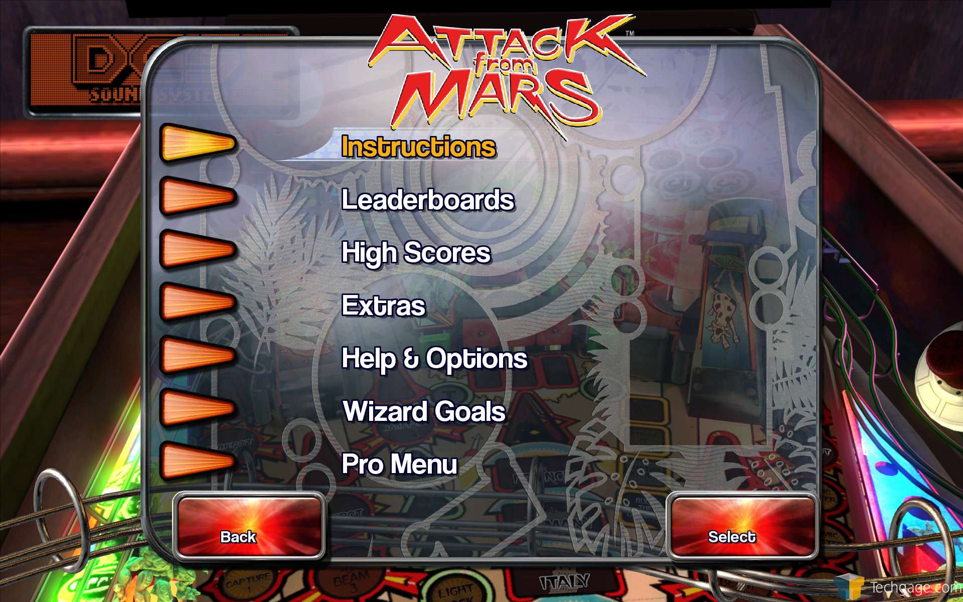
From a 70's pinball ambiance (habitrails, orange light arrows, hawaiian palm trees):

the_pinball_arcade_02.jpg


To a 90's very cheap DVD menu style (where's the pinball spirit/ambiance?)

SjLXVCO.jpg
 

Gorgar

Active member
Mar 31, 2012
1,332
8
Personally, I love the look of the new UI. But the main menu bothers me a bit. It should have My Tables, Tournament, Challenge, and Head to Head out front in center. Random, Recently Played, Newest Table, and Table of the Month should be the crap at the top with mysterious symbols that are difficult to decipher.

A 70's looking UI makes no sense with just 6 tables from the 70's in TPA and a bazillion from the 90's.
 

Tron

New member
Jul 8, 2012
128
0
How did this get clearance?

The frontend is bad let's be truthful here. First splash screen has the regular Pinball Arcade banner the next screen a garish *NEW banner and once you fumble your way to the table select screen it goes back to the old banner. Product placement? One or the other preferably the older one.

Icons look unfashionably 90's Genesis/Windows95 era, some I don't even get what they lead me too and when pressed take a few seconds to register occasionally freezing the screen.

Table names inside pinball's is not a good idea, fine if I'm gaming on the phone but if your sat on the sofa a few feet from the screen they are hardly eligible. And when you finally navigate to actually playing a table your struck in the eye with a fugly grey border around the free cam demo. Why cut a portion of the screen away spoiling the table artwork.

Looks dated unprofessional and spoils the overall impression of the game.
 
Last edited:

Metalzoic

New member
Jun 8, 2012
907
0
A 70's looking UI makes no sense with just 6 tables from the 70's in TPA and a bazillion from the 90's.

Forget his 70's vs. 90's reference. The point was the new one looks like software from 20 years ago, the old UI is leaps and bounds better from a presentation, artwork, style and theme perspective.

The only thing better about the new menu is some of the added functionality, but they even managed to **** that up by making it clunky and harder to navigate.
 

Xanija

Moderator
Staff member
May 29, 2013
1,348
0
Wow, look at the Steam reviews of the last 30 days. Only 46% positive. This is not exactly what you want to see on your store front. Especially when the product overall has 74% positive reviews. It will tell everyone the product has become worse recently and it will have an impact for sure. It's time for some serious crisis management FarSight, if you haven't figured that out already by yourself.
 

dave950lam

New member
Apr 20, 2012
838
0
Perhaps FS wanted to release a nostalgic-themed UI. There's just some bugs and other things the testers missed. It is the first release.
 

pedersonsx

New member
Apr 17, 2015
70
0
I enjoy this "product" as much as any in the past 10 years. Sure, it has it's faults (bugs) like 95% of all games on every platform now days. FS is damned if they do & don't, double edge sword deal. Everyone can still play Pinball, follow the 95' Windows instructions, their pretty straight forward....
 

Crawley

Member
Mar 25, 2013
706
4
Somehow I don't think there's a large influx of new consumers looking to buy the game. The game has been out for over 4 years now and has likely gotten everyone that was interested in it to bite. So recent poor reviews over the UI or not the game will continue to make money from the majority that are already hooked buying tables by seasons or month-to-month.

To me the UI doesn't look that great and seems clunky for the PC. But it allows me to organize/find and launch the tables much quicker. When it comes down to it that's what I want to do - play the tables.
 

greatdane

New member
Feb 19, 2015
49
0
I still don't get the design decisions with this new UI. Why place the most used menu for game modes and tables in the top left corner, while less used features are placed in the middle of the screen. The logo on the main screen looks very out of place in art style compared to the rest of the menu. Too colorfull and the word "pinball" is almost unreadable.
 

Snorzel

New member
Apr 25, 2014
1,353
0
The new UI downloaded whlie I was not looking on Steam. Have to say I totally agree with the general feeling being expressed by other users, it looks like a work in progress at best and is less intuitive to navigate. I could learn to live with it but I just wonder why did it have to come?

The thing that makes me unhappy with the game is not the addition of the new UI but the serious lack of bug fixes for tables already released. There are some that have never been right and things have just moved along (Black Knight) I accepted that as just the way it is, but when a new update breaks a table that was working correctly and 2-3 updates go by with nothing done to return it to its correct state I cannot accept that. The game I paid for is the Pinball Arcade not the User Interface Arcade. Please dont waste any more time on the menus and just fix what people actually play. I will not buy any new content until MB multiball cam and ToM mirror are restored and no old tables are 'broken' by a new update. I am interested in indy500 but its the principle.

The only explanation I can think of for them to push out this unfinished UI and neglect fixing already purchased dlc is the new Stern deal (pure speculation) they said no cab support due to Sterns request, their new partner may have required them to crap this out to prevent the cam mod on the cab users. Its been in the works for so long why else push it out now when still not ready unless they had to, its not like more waiting would matter to most of the user base at this point. I hope all you cab guys get your setups working with this new interface asap, especially if what I guess they were trying is correct :)
 
Last edited:

Members online

No members online now.

Members online

No members online now.
Top