-
Welcome Back to Digital Pinball Fans - please read this first
You are using an out of date browser. It may not display this or other websites correctly.
You should upgrade or use an alternative browser.
You should upgrade or use an alternative browser.
PP is causing poor artwork image quality - proof
- Thread starter kimkom
- Start date
Pinballwiz45b
Well-known member
- Aug 12, 2012
- 3,681
- 34
Yep. That's the cause of the problem of Post Processing. Confirmed.
Roo
New member
- Jul 5, 2013
- 158
- 0
Are you also seeing a change in smoothness on the silver border around the menus with post-processing on/off? I use to see that - I could sit in the pause menu flipping it on/off and see a change in the menu border and around the logos. I thought maybe it was related to the fact that the AA wasn't working when post processing was on (although I don't know how/if AA affects 2D assets). This is no longer happening for me though, but I'm not sure if it's related to a new build or moving from 1680 x 1050 to 1920 x 1080.
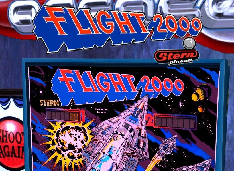
But even your "PP off" screenshots still don't look right to me. It's most obvious on the Flight 2000 logo. There shouldn't be those black "stair step" edges inside the red area along the white lines. Look at this pic of the real logo. There is no black in there. Compression wouldn't add black color that's not there. Actually, you can see compression in that pic I linked - inside the blue area all along the white lines. It just looks a little fuzzy - no hard black corners/specs.
You can still see it in Gorgar as well, particularly in the tails of the G's.
On my machine, regardless of the PP setting, the logos look like your "PP off" pics in the table select menu and like your "PP on" pics once you load a table and are in "attract mode" before you start a game. Here's a screenshot of that:

Notice how much better the logo on the backglass itself looks. It's interesting that the same logo looks so much worse in the table than at the table selection menu. I actually measured with a ruler on my monitor and they are being displayed at nearly the same size, but not quite. So you might be right about scaling.
I actually think it looks like the same issue I reported awhile back about the AFM playfield. Same black "stair step" effect that destroys what should be crisp lines.
But even your "PP off" screenshots still don't look right to me. It's most obvious on the Flight 2000 logo. There shouldn't be those black "stair step" edges inside the red area along the white lines. Look at this pic of the real logo. There is no black in there. Compression wouldn't add black color that's not there. Actually, you can see compression in that pic I linked - inside the blue area all along the white lines. It just looks a little fuzzy - no hard black corners/specs.
You can still see it in Gorgar as well, particularly in the tails of the G's.
On my machine, regardless of the PP setting, the logos look like your "PP off" pics in the table select menu and like your "PP on" pics once you load a table and are in "attract mode" before you start a game. Here's a screenshot of that:

Notice how much better the logo on the backglass itself looks. It's interesting that the same logo looks so much worse in the table than at the table selection menu. I actually measured with a ruler on my monitor and they are being displayed at nearly the same size, but not quite. So you might be right about scaling.
I actually think it looks like the same issue I reported awhile back about the AFM playfield. Same black "stair step" effect that destroys what should be crisp lines.
Last edited:
Shaneus
New member
- Mar 26, 2012
- 1,221
- 0
Yeah, I'm not sure of the exact terminology that would be used, but as I understand it post-processing filters in general apply themselves at a particular resolution. I think the problem with TPA on PC is that rather than doing it at a 1:1 resolution of what the game itself is running at, it's at a far lower ratio. No idea why it hasn't been fixed yet.Post processing is causing what I described as a 'scaling issue'. i.e. ragged edges around the logos. The rest can be put down to image compression.
See images for Post Processing on/off comparisons.

Personally though, I'd rather they just get all the colours looking as good as possible without PP. I've added some colour-adjusting PP myself outside of the game and while it does add barely noticeable lag, it makes the game look far better IMO (and doesn't cause the resolution/scaling issue).
kimkom
Member
- Jan 28, 2013
- 914
- 1
- Thread starter
- #6
Are you also seeing a change in smoothness on the silver border around the menus with post-processing on/off?
No, menu buttons seem unaffected. As does the TPA logo on the title screen, which looks fine.
EDIT: Just to avoid confusion, the TPA logo in the above images is from the main menu screen, not the title screen.
Last edited:
- Feb 19, 2012
- 8,144
- 2
I agree, post processing is broken at this point.
I play only with it off
Timelord ...
+1
lio
New member
- Jul 24, 2013
- 210
- 0
+1
HUD Images look a lot better without PP enabled on my system as well, not like some sort of pixel-resized images with jaggies.
Roo
New member
- Jul 5, 2013
- 158
- 0
Table logos are much better in version .023. Not perfect, but good enough that I'll probably stop noticing it (and will stop complaining about it  ).
).
I'm not noticing any difference with post-processing on/off, but then again I never was. Nvidia GTX460, 4GB RAM, 1680 x 1050.
I'm not noticing any difference with post-processing on/off, but then again I never was. Nvidia GTX460, 4GB RAM, 1680 x 1050.
lio
New member
- Jul 24, 2013
- 210
- 0
Also 3D rendering is affected, see (again) my comparison screenshot (left: PP off, right: PP on):

It would be very nice indeed if that was fixed at some point.
same here - the new logos do look somewhat better but PP still has a visible negative impact on them - just as it does cause some ingame "jaggies" as shown on your screenshot. I can only assume it is because the PP is rendered to maybe a 512x512 texture rather than full resolution - would be good to have some sort of control over the PP quality.
Shaneus
New member
- Mar 26, 2012
- 1,221
- 0
Yeah, I thought that might've been the case with the rendering resolution. Rather than the blocks being dynamic and "fixed" (so the jaggies are in the same spot on the table items) it's like you're looking through a blocky filter like you said. I still don't know why it's not fixed :/
kimkom
Member
- Jan 28, 2013
- 914
- 1
- Thread starter
- #14
I guess it's pretty straightforward to fix on the menu screens. It just requires Post Processing to be switched off in the code. There's no need for it to be on during table selection etc..
Obviously another solution is required for table rendering.
Obviously another solution is required for table rendering.


