-
Welcome Back to Digital Pinball Fans - please read this first
You are using an out of date browser. It may not display this or other websites correctly.
You should upgrade or use an alternative browser.
You should upgrade or use an alternative browser.
The Official Latest NEWS And INFORMATION Discussion Thread
- Thread starter PiN WiZ
- Start date
Tann
New member
- Apr 3, 2013
- 1,128
- 1
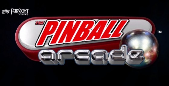
Why a new logo? Does it mean the new UI is near to be released?
Now, let's compare:


The new logo is nice... but a little too much heroico-gothico-fantasy (why this gothic font for Arcade, and this purple monster hand?).
I don't really see the connection with pinball in general. The incandescent light bulb in the ball is a nice touch, though.
A matter of taste (without the monster hand, and keeping the red main colour of the previous logo, it could be ok).
Now, let's compare:


The new logo is nice... but a little too much heroico-gothico-fantasy (why this gothic font for Arcade, and this purple monster hand?).
I don't really see the connection with pinball in general. The incandescent light bulb in the ball is a nice touch, though.
A matter of taste (without the monster hand, and keeping the red main colour of the previous logo, it could be ok).
Last edited:
- Mar 14, 2012
- 7,334
- 0
The 'the' and the lightbulb ball are very much in line with The Addams Family, as is the lightning bolt. So hmmm, I wonder why the change 
DanBradford
New member
- Apr 5, 2013
- 648
- 0
Maybe they are coming out of the closet?
IGoFirstIndy
New member
- Jul 12, 2014
- 1,096
- 0
It reminds me of zen pinball for some reason.
David Pannozzo
New member
- Mar 6, 2012
- 536
- 0
Maybe that's a weird sign that we won't have to do Kickstarters for licensed games anymore, and also were going to see some amazing changes with The Pinball Arcade. One can at least dream, am I right.
Pinballwiz45b
Well-known member
- Aug 12, 2012
- 3,681
- 34
One year sure goes by really quickly...
Sun Vulcan
New member
- Jun 28, 2012
- 290
- 0
What was updated on Steam today? Anybody know?
Version 1.51.12 (6/23/16)
- Fixed crashes in new UI
- Camera fixes on these tables
Addams Family, Attack From Mars, Creature From the Black Lagoon, Diner , El Dorado EM, Fireball, Funhouse, Hurricane, Medieval Madness, Ripleys Believe it or Not, Starship Troopers, Twilight Zone
http://steamcommunity.com/app/238260/discussions/0/522730075555541004/
Pinballwiz45b
Well-known member
- Aug 12, 2012
- 3,681
- 34
Version 1.51.12 (6/23/16)
- Fixed crashes in new UI
- Camera fixes on these tables
Addams Family, Attack From Mars, Creature From the Black Lagoon, Diner , El Dorado EM, Fireball, Funhouse, Hurricane, Medieval Madness, Ripleys Believe it or Not, Starship Troopers, Twilight Zone
http://steamcommunity.com/app/238260/discussions/0/522730075555541004/
Camera fixes: Includes both plunger and gameplay, set to align with other tables. Here are the changes anyway:
Addams Family: Angles were changed, compared to previous iterations. #3 is noticeably higher.
Attack From Mars: Plunger Camera was changed to align with other tables, and the third view is higher than previously.
Creature: Camera brought back to the point of seeing the top part of the apron.
Diner: Camera brought back to the point of seeing the top part of the apron; third view is slightly higher, and Plunger Cam #2 allows sight of the jukebox.
El Dorado EM: Camera brought back to the point of seeing the a bit more of the apron.
Fireball: (Honestly, I can't tell any difference.)
FunHouse: Camera #3 is noticeably higher.
Medieval Madness: (Honestly, I can't tell any difference.)
Ripley's: Flippers no longer close to the bottom of the screen; #3 pulled back to reveal part of the apron.
Starship Troopers: #3 is much higher, possibly eliminating the problems of seeing the upper lanes during normal play.
Twilight Zone: #3 pulled back to reveal a bit more of the apron.
I want to see a Wizard of Oz Table. I just thought I would mention that!
Have you ever played it in real life? It's not good.
If you're referring to the Jersey Jack table I totally disagree. I played it multiple times at the Silverball Museum in Asbury Park and loved it, the Hobbit is great too.
Scott
Scott
Have you ever played it in real life? It's not good.
