Zaccaria Pinball - Update v1.4

Zsolt

A.S.K. Homework
Apr 2, 2013
595
1
Request for Zsolt:

Could all adjustments made on a table also been saved per table? The only thing that seems to save individual are the graphics adjustments, but not day/night mode, dirt settings and physics, which are global settings that affects all the tables. For example, I really like the look of the scratched surface on Hot Wheels but not on Pinball Champ. I also would like to experiment with different physics settings.

Great to see there will be % behind the sliders in the next update. And the new 'start' button looks good, much better than the old one.
We have to make some changes in menu system to able to implement a save system that can manage these things correctly. For example, save them per table, copy them to all tables or selected tables, share them to others etc.
 

night

New member
May 18, 2012
2,109
0
We have to make some changes in menu system to able to implement a save system that can manage these things correctly. For example, save them per table, copy them to all tables or selected tables, share them to others etc.

Yes absolutely, and I understand this is not an easy thing that can fixed overnight. I hope that it can be done in the future. I think this would be the ultimate option to complete the Zaccaria menu.
 

norbert26

New member
Apr 21, 2013
602
0
Looks like another amazing table!

But why an option to resize the ball?
its a nice option for smaller screen devices. I like a little bit of substance to the ball however the default ball size has not been an issue so far. EDIT for afterthought: Making ball a tiny bit bigger will address the issue of i could not see the ball go down behind the flippers in cam view 1 on certain tables. Good going my gold membership dollars hard at work good investment !!!!
 
Last edited:

norbert26

New member
Apr 21, 2013
602
0
Looks like another amazing table!

But why an option to resize the ball?
reevaluations on this issue. Using locomotion for an example i can not see resizing the ball any bigger. If i made the ball any bigger its NOT going through the railroad station on the middle of the playfield. The ball is correctly sized by default to fit the inlanes (and outlanes) correctly and correct ratio to playfield items. Unless one wants to resize the ball smaller which i do not i will be leaving this alone and i hope the selector for this is labeled DEFAULT for the default ball.
 

night

New member
May 18, 2012
2,109
0
reevaluations on this issue. Using locomotion for an example i can not see resizing the ball any bigger. If i made the ball any bigger its NOT going through the railroad station on the middle of the playfield. The ball is correctly sized by default to fit the inlanes (and outlanes) correctly and correct ratio to playfield items. Unless one wants to resize the ball smaller which i do not i will be leaving this alone and i hope the selector for this is labeled DEFAULT for the default ball.

The ball size is the least thing on my mind when playing Zaccaria, I think it's just correct. The ball 'look' is a different thing, I wrote about that before. I think TPA has an excellent chrome ball, I kind of struggle a little with Zaccaria's ball look. Has to do with the environmental image map that they put on it, it looks like a small yellow/orange house with a garden if you look real close, that should be just a plain softbox/square type of reflection in my opinion. (You already have the reflection of the table on the ball.) Or at least put that option in the extra balls, which is.. well, the extra balls are pretty useless now. Flipper colors I never use either. A good comment been made on that is flipper transparency.
Glass reflection is another thing, they put 5 options there and I don't think one of them is really working. Some scratches, something hazy/misty, it doesn't feel like glass. It's there, but it could be done better to have a real function. (Which is cosmetic anyway). It's all in the details now. Well, we see how things develop, at least it's working very well, playing very well and looking real good.
 
Last edited:

SilverBalls

Active member
Apr 12, 2012
1,233
3
As night said the ball look is crucial. I can't comment on Ask's ball but the ball look in Zen is one of the reasons I just can't get into Zen - the ball is like a 100 watt light bulb - why ruin a game with such as ridiculous ball?

I also agree the PA ball is spot on perfect.
 

dagwood

New member
Feb 2, 2013
123
0
I don't think Zen Pinball is the same type of pinball game that we have in the TPA & Zaccaria table recreations. They are so much larger and crammed with detail that the ball can't really be made the size that you have in recreation sims like TPA, hence the ball trails ;) If Zen pinball tables were to be made into real life they'd be huge!
 

SonicBrain

New member
May 17, 2013
211
0
getting beter and better ! tell me u guys will make another collection after Zaccaria it's complete ! SEGA ? Capcom ? and go beyound ....go PS4 ! not Ice box none ! Sony support Small producers ... :)
 

Zsolt

A.S.K. Homework
Apr 2, 2013
595
1
FYI we have sent the update v1.4 to Apple for review last Friday. Sorry for we haven't noticed you about this so far!

Here are which final changes v1.4 include:
- ADDED a new pinball table, Robot
- ADDED a new option that changes size of the ball

- FIXED iCade controlling issue
- FIXED slider value displaying in %
- FIXED Time Special on Locomotion table
- FIXED Orange Special on Pinball Champ
 

Kolchak357

Senior Pigeon
May 31, 2012
8,102
2
I had a ball get stuck above this post (see yellow arrow). I was able to nudge it off, so it is no big deal.
The table seems like it need to be shifted down a little in camera 1, landscape view. I see too much of the bottom of the table, while the to is a little cut off. The picture doesn't do it justice. Check it and see if you agree with me.

x8f7.jpg
 

jhamdotme

New member
Apr 14, 2012
151
0
Good update. Here are some things that I’ve noticed.

UI Settings: Fade
You can't change the camera angle before starting a game. When you have the UI Settings set to "fade", the camera icon will be invisible by the time you can change it. If you blindly stab at this hidden icon, you can still change the camera icon, but you won't be able to see which camera angle you have it currently set to.

I appreciate that we can hide these icons. I really like the clutter-free look that we can get, and I’ve mentioned this a couple of times before, but the icons need to re-appear when they're tapped, temporarily. Otherwise, it's impossible to see what setting you're using.

Camera Settings
Camera 1 in portrait mode is still my favorite, with the static view, but I really like the new angle that's used for Camera 2. It's flat and overhead, and the scrolling is pretty subtle. Some of the angles continue to be unusable. Camera 4, in particular, seems pretty bad. Often, the ball will get to the bottom where your flippers are before the camera does.

End of Bonus Time
I like the new sound effect that indicates that your bonus time has ended. But maybe there could be a slight callout to the Bonus Time text when this happens, too, to emphasize what's happening. And maybe the lights on the table could fade.

It might also be nice to have an explanation appear onscreen, as part of a first-launch experience. This should probably only appear once, so as not to annoy the user. But it would clearly communicate to new users what's happening here.
 

night

New member
May 18, 2012
2,109
0
Robot, very fun table! Great job.
Camera angle 1 needs a bit more tuning, there is too much space below..

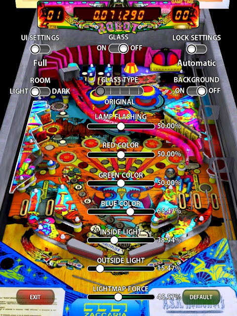
Here are my graphic settings. I tweaked the inner and outer lights, found the default too dull & grayish. Also I tuned the blue a bit higher. Lightmap is down as well. I think overall the table has more 'pop' now. :)

robot.jpg
 

Members online

Members online

Top